Saturday, October 31, 2015

Space and Colour in Adventure Time #45


The layout of this page is a deviation from standard comics because although it is a “strict grid pattern” (Lefèvre 161) at first glance, once it is read it becomes what might be best described as cyclical, for the interaction between panels becomes more complex and dependent on earlier panels for furthering the plot. Additionally, the reader is beginning in a standard left to right reading, but the comic’s layout demands that the reader rotate the book physically in a way that does not often occur in standard comics. In my own experience reading this comic I first felt that it would have greatly benefitted from guided view reading because it would enable the reader to experience the same misunderstanding as Finn does when he thinks that the material we known is separating rooms is not just a mirror. But the more I thought about it, I came to a different conclusion. 

The comic’s layout and plot play with time and space in a very interesting way and not seeing the bigger picture immediately would make this more intriguing but it would also make the relationships between panels in the larger space lessened. In a way we can read the comic (as indicated by the red arrows) in a normal one panel at a time, but we can also read it as pairs of panels (top and bottom) since the divider itself is referenced in character’s speech and visually draws the eye due to it’s colour.

Speaking of colour, Scott McLeod writes in Understanding Comics “the differences between black-and-white and colour comics are vast and profound, affecting every level of the reading experience” (192). This lead me to think about what the comic would be like without the current colouring. The reader would probably have more difficulty orientating his or her eyes on the page, as the bright red arrows would not draw the eye any longer. Also, you might not see the pairs of panels right away as with the colour present you immediately pick up that Finn and Jake are present but also quickly make note of their orientation in the top panels. I would assume that this would be hindered somewhat with just black and white. The overall “spooky” tone of the comic would be lost without the blue colouring which features in a large percentage of the panels of this comic. What might occur instead would be that more drawing would have to be included in each panel to reinforce the same mood that is achieved easily with colour.

Jessica Steinhoff


Works Cited

Lefèvre, Pascal.  “The Construction of Space in Comics.”  A Comics Studies Reader.  Eds. Jeet Heer and Kent Worcester.  Jackson, MS: University Press of Mississippi, 2009.  157-62.


  • McCloud, Scott. Understanding Comics: [the Invisible Art]. New York: HarperPerennial, 1994. Print.

Wednesday, October 28, 2015

Movement in The Flash #44

Motion in The Flash is probably one of the most important aspects because, well, the Flash likes to move a lot and fast. There are multiple ways that the artists show movement in the piece.

One of the ways they show movement is the example to the left. In this image, the Flash is shown in three images in progression. The bubbles show movement within the water. This shows the reader the character in different stages of his path but it also shows the entire path at once. The reader can take this as his moving fast or that he was simply moving at all.


On the right, motion is shown through the splashes of water, motion lines in the bottom corner (there is more to the comic page), and through the lines in the sand caused by the Flash dragging his hand to drag himself out of the water. On this page, all but one frame has some form of motion. Given that there are so many instances of movement, it would be repetitive for there to only show one form of it.

On the left, motion is shown through both lines and the colour red which is associated with the Flash and his powers. The character simply standing in the form that they are shown in might have been enough; however, it would not point towards his moving at Flash speed, only regular speed.

Again, on the right, lines suggest the motion of zooming in on a face as well as one character hits another.

This comic uses motion lines, colour, pictures, body position, and multiple bodies in succession all to show the reader various ways and speeds of movement. If there was only one method, it would be too frequently repeated given how much movement there is in this piece. The artists needed to employ many different methods in this single comment in order to show the variety that the characters would have used, were they real people.

-- Kelsey

Sunday, October 25, 2015

Groensteen's Verbal in Godzilla in Hell


For my first blog post I will be looking at Godzilla in Hell in regards to Groensteen’s view on verbal context in comics. Now, while the title does explain what the comic is all about, I should mention that Godzilla in Hell is actually a collaborated piece done by a different artist and writer every issue. This makes things somewhat easier as I am able to talk about a theory can be used though also a bit harder the two volumes I currently have are quite different. With that out of the way let me discuss this theory for each issue.

The first issue of Godzilla in Hell has no dialogue in it and only a small handful of words. Those words are huge stone letters that spell out the famous “Abandon all hope ye who enters here” from Dante’s Inferno. As Groensteen mentions, these words are used to help the reader understand just where we are exactly; if the title wasn’t enough of a giveaway for you. The only other word shown is the word “Lust”, this one doing a lot more for the reader as we now know what level of Hell Godzilla finds himself in. This allows use to predict what will happen next for him.


In the second volume the verbal is used differently. Nearly all frames have a caption box that describes what is happening to Godzilla and also what he is feeling and thinking. While it could be argued that the caption boxes are also used to help the reader understand what is going on since the art is more water colours and blurry than the last volume, it seems that this time the verbal is used to set the tone for the comic. The words chosen give this issue a more epic feel to it. Fitting of the images though sometimes we are reminded of the media we are reading here.


Overall, though, both issues do rely more on the pictures to tell the story rather than using words to explain what is going on. We get this more so from the first issue where Godzilla’s expression tells us more about what he is thinking and feeling than any words. The second issue does rely more on words but even then it is to help us understand what we are seeing. Both use the verbal in a way that adds to the comic not take away from it, though I feel that the first issue did this better. 

Kristen Barney
103857330

Tuesday, October 20, 2015

Panel Framing and Syntagm in "The Complete Calvin And Hobbes: Book Two"

      Calvin And Hobbes is a daily comic created by cartoonist Bill Watterson. Syndicated from 1985 to 1995, the comic has become a classic, and has been featured in over 2,400 newspapers across the globe. Many of the strips have since been compiled into collections and sold as complete books. For this post, I chose to focus on the strip on page 42 from book two of "The Complete Calvin And Hobbes," which was a strip published on February 21, 1988.


   This particular strip - starring only Calvin - is silent, but still provides an effective narrative for the reader. It brings us through the process of Calvin preparing to go play out in the snow, only to realize by the time he makes it out his door that he needs to use the washroom, causing him to go back inside and remove all of his snow gear, as many young children would.

  Something I find interesting about this strip is the framing of the panels. Most of the panels in this strip do not have definitive borders, which affects the separative function, one of the functions of a panel theorized by Groensteen. Instead of each panel being its own separate frame, the panels - which are only recognized as drawings of Calvin - each represent a single moment in Calvin's process, and are set in a non-parallel fashion to create a flow. Each of these panels lead up to his departure to the outdoors, which features a setting and a definitive border, which signify that this moment is important, acting as a climax within the strip. This climax is a syntagm, which consists of Calvin's descent outside, his sudden realization and his decision to go back inside. This syntagm is easy for the reader to identify because of the borders of the panels in the first and third frames of the sequence. If it were not for the definitive borders of these frames, these moments may not have been initially prominent to the reader, and the reader may have had to reconsider these earlier panels after completing the strip. Though the reader does not find out why Calvin goes back inside until the last panel of the strip, these borders allow the reader to consider his actions carefully before reading to the end of the strip. I think Watterson's use of borders in this strip and their separative, expressive and readerly functions was very effective in making this silent comic an enjoyable and relatable experience for the reader.

Monday, October 19, 2015

Transtextuality in Toil & Trouble #1


Something wicked this way comes...

Toil & Trouble is a comic written by Mairghread Scott and illustrated by Kelly and Nichole Matthews.  It tells the story of Shakespeare's Macbeth from the point of view of the iconic three witches.  Many place Macbeth on a high literary pedestal (like me...English major here), or maybe it just haunts you in your high school nightmares.  Regardless, most adults in the western world are familiar with Macbeth, and so there are challenges in taking such a famous text and asking readers to interact with it in new ways.  Will it still make sense and have the same emotional impact?  This will be explored using theories of transtextuality defined by French literary theorist Gérard Genette.

Hypertextuality is important in Toil & Trouble because without Macbeth, this comic would not exist.  The original plot line is not being changed; the reader is instead given a new layer of perspective, a look at what the witches are up to during the events of Macbeth.  Though the characters come from Shakespeare, Scott has taken liberties.  For instance, the witches now have names.  This gives us an insight and a connection to these characters.  Smertae is the witch that narrates the story, and we see her narration boxes in yellow, separate from the story's dialogue balloons.  


Most will recognize these lines from the opening scene of Macbeth, and this is how Scott ties us into the story.  While I personally have the context to recognize this dialogue, some people may fail to make such connections.  Would the comic still have the same effect on someone who has never read or seen Macbeth?  Surely it would still make sense, but I would argue that knowing the original story significantly adds to the enjoyment of this comic.


I find this particular panel fascinating.  The hypertextuality between Macbeth and Toil & Trouble is illuminated in the drawing style.  The action of the panel, the 'first layer', is the fight between Macbeth and Macdonwald, which is alluded to in the play.  But on the 'second layer' we see three distinct circles framed within the panel.  These give us another layer of meaning because they indicate instances where the witches are intervening in the battle.  The use of a single colour, blue or green, differentiates these areas from the rest of the panel.  When they are juxtaposed with the comic's colourful world, we can see the witches'  influence.

It is made clear to the reader that the witches are responsible for the outcome of the story.  We find out that the third witch Smertae breaks the sisters' plan and helps Macbeth defeat Macdonwald to set the story as we know it in motion.  I know the plot of Macbeth, and I'm well aware of the not-so-happy ending... yet I can't wait to read what happens next.

Lauren Farquhar


Thursday, October 15, 2015

Peering into the Colourful World of Tokyo Ghost


            In chapter eight of Understanding Comics, Scott McCloud claims that some believe "colors can have profound physical and emotional effects on people" (185). It can easily be seen how this principle is applied to comics, even more so a comic as modern and intelligent as Tokyo Ghost, written by Rick Remender with art by Sean Murphy and colouring done by Matt Hollingsworth. Although I haven't been in contact with any of these three as of the date I'm writing this, I can wholly say that Hollingsworth's work speaks volumes for itself as the contrasting colours of Tokyo Ghost are some of the first things that grabbed (and held) my attention while reading his comic.


            From its opening page, a status quo is set for the book's use of colour. A group of homeless people converge by an open fire, illuminated in warm orange light. This is one of the few simple or relaxed scenes in the entire book, and it's contrasted by the murky blue-green sewers of a wasted futuristic Los Angeles. This slice of humanity amidst an otherwise cold and technologically-obsessed society is highlighted through Hollingsworth's use of colour, and readers will quickly find that the orange/blue colour scheme is kept up throughout the remainder of the issue.


            A turn of the page reveals a two-page spread so awesome that the only reason I'll refrain from showing the whole thing here is the risk of spoiling a possible subject for my annotated comics page. The page contains our two main heroes, Led and Debbie, nabbing a criminal while zooming through the city streets on a kickass motorcycle that looks like it was ripped straight from of the pages of Akira. What makes this spread so enticing, other than the miraculous detail on Led's motorcycle and the surrounding environment, is the repeated use of colour first seen on the previous page. Our heroes are displayed in bright orange, almost glowing amidst the the grimy and dingy bluish-grey city. In Mise-en-Page: A Vocabulary for Page Layouts, Jesse Cohn states that colour contrasts, among other things, are used by artists to "steer the eye from one point to the next" (52). This is exemplified here, as readers are immediately drawn to the two characters and their motorcycle before eventually letting their eyes wander to the outer edges of the page and the smaller details held within them. Colour is especially important in a page as detailed as this one, as the lines of the main subject could easily be lost in the chaos of the page as a whole in black-and-white.


            One last thing I'll comment on is the top half of page 16, which shows a massive explosion erupting from within a racetrack. The fire is, appropriately, bright orange as it spills out into the moonlit city bathed in blue and black. It's impressive how Hollingsworth maintains the colour scheme throughout these three very different scenes while keeping it thematically sound. In this case, the chaos of the previous scene can be thought of as "exploding" out into the quiet streets surrounding it as the action escalates. The contrast between the orange and blue is more bold and apparent in the page than in the previous pages, signifying the rising action of the plot.

            I hope it goes without saying, but I thoroughly recommend Tokyo Ghost and can't wait to grab the second issue when it's released next week.

Written By: Andrew Masse

Works Cited:

Cohn, Jesse. "Mise-en-Page: A Vocabulary of Page Layouts." Teaching the Graphic Novel. Ed.   Stephen E. Tabachnick. New York: Modern Language Association, 2009. 

McCloud, Scott. Understanding Comics: The Invisible Art. Ed. Mark Martin.
            HarperCollins Publishers, 1993. Print.

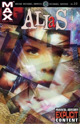
Is Issue 10 of Alias a Comic?

Alias created by Brian Michael Bendis (writer) and Michael Gaydos (artist) under the Max Comics imprint of Marvel uses a number of created page layout throughout the 4 volumes of this comic series. One of the most interesting in terms mixing visual and textual elements is in issue number 10.
This issue of Alias is completely different from any of the other issues. There is no regular use of distinct panels, or really panels of any kind except for a few instances, nor do the visually elements carry the story. The plot is mainly conveyed by the textual elements, in this case in what looks like a transcript of the conversations. There is neither word bubbles nor caption boxes to go along with the images, just the conversation transcript layered overtop of the images.
This leads us to an important question: is this issue truly a comic? Scott McCloud makes it clear in Understanding comics that for a piece to be considered a comic there has to be a mixing of pictures and words with most of the plot line relying on the images. In an interview discussing whether or not illustrated children’s books could be considered comic, McCloud states that it would not be “if the prose is independent of the pictures. Not if the written story could exist without any pictures and still be a continuous whole” he goes on to states that “If the pictures, independent of the words, are telling the whole story and the words are supplementing that, then that is comics”. This could be used to look at this issue of Alias where the images are independent of the textual elements and the images do not tell the majority of the story. Due to this it could be argued that issue number 10 is not truly a comic since it relies on prose to convey the story.
In the end, It all depends on whether or not a reader considers prose heavy pieces such as this one to be a comic or not. And if this piece is not a comic then what is it? 

-Kaitlyn Renaud 


Narrative and Assumptions about the Graphic Novel


Fig. 1. Wonderful Life with the Elements cover (Yorifuji)

When I first glanced over Wonderful Life with the Elements in the Leddy Library graphic novel collection I immediately thought to myself “is this actually a graphic novel?” I certainly could have moved on to a different selection, one more clearly a graphic novel, but my inability to immediately answer this question caught my attention. A study of the work itself and an analysis of it through points made by Scott McLeod and Anne Magnussen lent framework through which to understand Yorifuji’s work as a comic and solve my confusion about it.

What is it about Wonderful Life with the Elements that made it so difficult to categorize as a graphic novel? Admittedly this required more thought than I expected, and perhaps while these characteristics might be seen more readily by experienced comics readers, as someone who has never read a graphic novel before and only occasionally read daily comics, perhaps I suffered from more extensive and limiting assumptions of what comics can be. Even as someone who has studied the complexities of both literature and art, I had never given much thought to comics as an area of serious academic study, theory, and critique. It seems to reside in a world separate from each but ultimately is a combination of both in many instances.

My initial impression was that there was no narrative in this book, as in I was not following events or characters and this struck me as a necessary part of comics. However, when I went back and looked at various definitions of what comics are, I began to understand the complexity of the genre and also the diversity of opinions about it.

My first contact with any comics theory was with Scott McLeod’s Understanding Comics and so I began my analysis through his simple definition of “sequential art” (5). This interpretation made me able to see this work as a comic clearly. I could find a sequence of art that made some type of flowing narrative, in that it connected facts and developed an understanding about the characteristics of the given scientific element.

Fig. 2. "Helium" (Yorifuji, 66)
Next, I reexamined Magnussen’s definition. What I found was not what I expected, my initial response to her definition was very different from McLeod’s but I actually found that her definition reinforced my understanding of narrative, which Magnussen deemed is generally used to interpret the “complex sign” (193) which to my understanding she means to denote the item created from drawings and text which constitute most comics. This I could clearly see in Yorifuji’s work, or rather his comic.

Narrative is not necessarily easy to point out in comics, but with an understanding of the function of narrative in comics I have been able to more clearly find it and make connections in the structure of the genre that I had not been able to before, nor had I been aware that I was missing out. Wonderful Life with the Elements lead me to challenge my assumptions about comics and develop another step towards understanding comics.

by Jessica Steinhoff


Works Cited
Magnussen, Anne. “The Semiotics of C.S. Peirce as a Theoretical Framework for the Understanding of  Comics.” Comics and Culture: Analytical and Theoretical Approaches to Comics. Eds. Anne Magnussen and Hans-Christian Christiansen. Copenhagen: Museum Tusculanum P, 2000. 193-207.
McLeod, Scott. Understanding Comics. New York: Harper Perennial, 1994.

Yorifuji, Bunpei. Wonderful Life with the Elements: The Periodic Table Personified. San Francisco: No Starch, 2012. Print.