 |
| BH: Age of Doom #1, Cover & Credits |
***STILL NO SPOILERS***
 |
| 4 Kids Walk into a Bank, n.p. (Ch 4) |
Many of you will know we studied 4 Kids Walk into a Bank this semester (created by Tyler Boss, Thomas Mauer, and Matthew Rosenberg). I got kinda stuck on the sound effects, trying to figure out how I still heard the smash of 'dick move' and sploosh of 'drugs.'
 |
| 4 Kids Walk into a Bank, n.p. (Ch 3) |
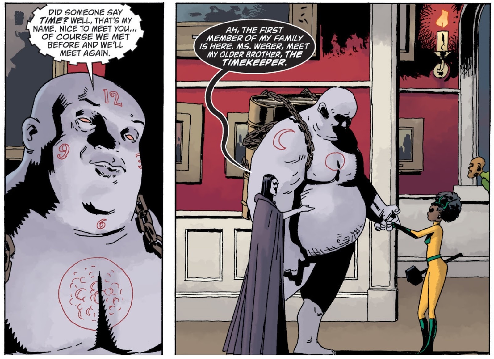
I experienced some of the same in the Black Hammer: Age of Doom series. A number of characters (particularly in Issue #3 when a protagonist is introduced to an--ahem--alternate family) have a unique voice, cadence, and tone to their speech.
There's still the usual approach to emphasizing some of the words with bold lettering, but the style of the balloons and font also affect how speech or sound is heard.
 |
| Issue #3, page 10 |
When the Timekeeper first spoke, it sounded cog-y to me, grinding and hollow, like rubbing two sticks together to make a fire but with copper tubing instead. It wasn't until the second panel (above) that I understood his weight and size would influence how I heard him, and I read his words again, this time as rumbling and heavy. It's possible others might hear a high and squeaky voice, his pace alternating between lightening fast and excruciatingly slow. The combination of his size and the gear-like word balloon could call up any number of sounds for the reader, but they all point to the essence of this character. And back again. It creates a never-ending loop of image as text, text as image. What's in the panel can't be separated from the text, nor can the text avoid influencing our reading of each panel and, indeed, the story overall.
The lettering artist here is Todd Klein, who also created the letters for The Sandman series. Even in these two simple panels, we can see his "traditional hand consists of clear, relatively undistinguished block capitals... his knack for using--and often creating--different calligraphic hands to add both graphic identity and storytelling content... especially in individual characters" (Kannenberg, 178). In fact, they are also an excellent example of all three qualities typography can assist with making meaning in comics: narrative, metanarrative, and extranarrative (Kannenberg, 166).
It's easy to understand why scholars "generally downplay the aesthetic contributions of text in favor of concentrating on its presumably transparent capacity as the vehicle for narration," but a closer look at the work of someone like Klein helps us see how important the typography is to any graphic text (Kannenberg, 165).
 |
| Issue #3, page 12 |
What I love about comics is how each of us can read the same text and come away with a different interpretation, and this series does that for us through its lettering.
No comments:
Post a Comment