Sunday, April 7, 2019

Lettering and Sound in Black Hammer: Age of Doom


BH: Age of Doom #1, Cover & Credits

***STILL NO SPOILERS***

4 Kids Walk into a Bank, n.p. (Ch 4)

Many of you will know we studied 4 Kids Walk into a Bank this semester (created by Tyler Boss, Thomas Mauer, and Matthew Rosenberg). I got kinda stuck on the sound effects, trying to figure out how I still heard the smash of 'dick move' and sploosh of 'drugs.' 


4 Kids Walk into a Bank, n.p. (Ch 3)
I experienced some of the same in the Black Hammer: Age of Doom series. A number of characters (particularly in Issue #3 when a protagonist is introduced to an--ahem--alternate family) have a unique voice, cadence, and tone to their speech. 

There's still the usual approach to emphasizing some of the words with bold lettering, but the style of the balloons and font also affect how speech or sound is heard. 
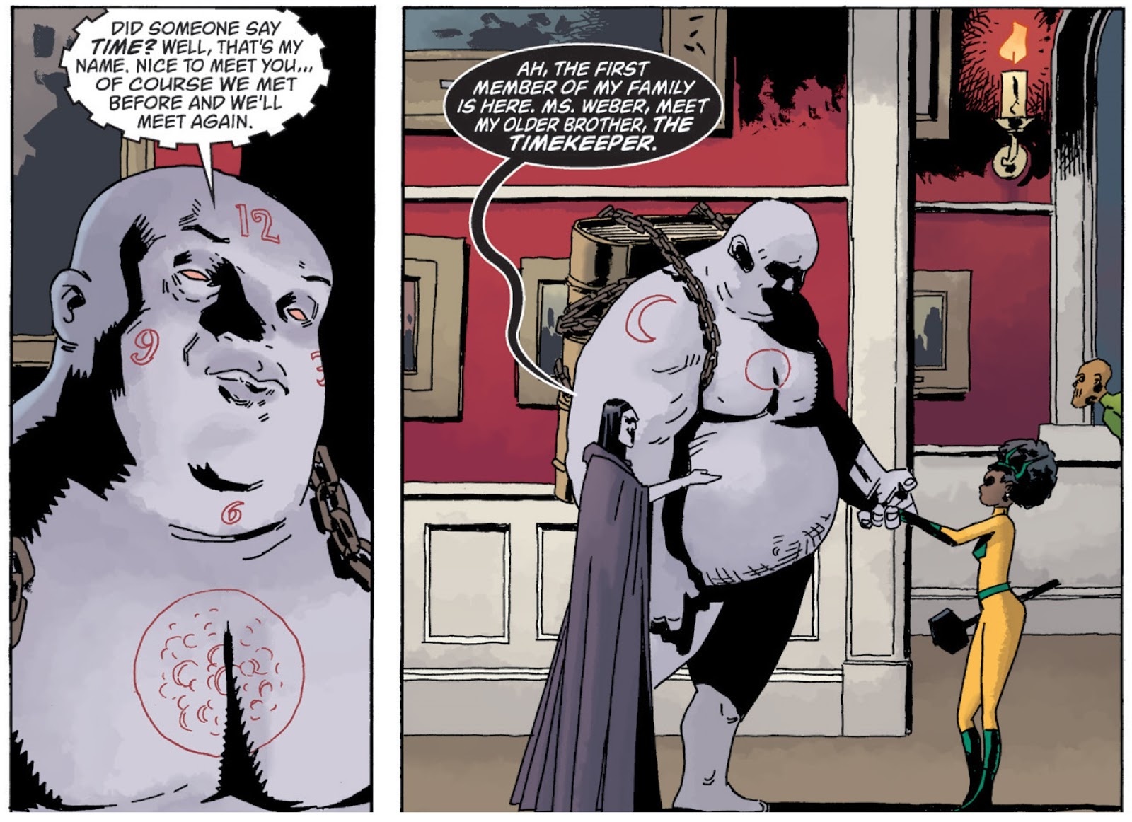
Issue #3, page 10

When the Timekeeper first spoke, it sounded cog-y to me, grinding and hollow, like rubbing two sticks together to make a fire but with copper tubing instead. It wasn't until the second panel (above) that I understood his weight and size would influence how I heard him, and I read his words again, this time as rumbling and heavy. It's possible others might hear a high and squeaky voice, his pace alternating between lightening fast and excruciatingly slow. The combination of his size and the gear-like word balloon could call up any number of sounds for the reader, but they all point to the essence of this character. And back again. It creates a never-ending loop of image as text, text as image. What's in the panel can't be separated from the text, nor can the text avoid influencing our reading of each panel and, indeed, the story overall.


The lettering artist here is Todd Klein, who also created the letters for The Sandman series. Even in these two simple panels, we can see his "traditional hand consists of clear, relatively undistinguished block capitals... his knack for using--and often creating--different calligraphic hands to add both graphic identity and storytelling content... especially in individual characters" (Kannenberg, 178). In fact, they are also an excellent example of all three qualities typography can assist with making meaning in comics: narrative, metanarrative, and extranarrative (Kannenberg, 166).


It's easy to understand why scholars "generally downplay the aesthetic contributions of text in favor of concentrating on its presumably transparent capacity as the vehicle for narration," but a closer look at the work of someone like Klein helps us see how important the typography is to any graphic text (Kannenberg, 165).


Issue #3, page 12
How do you hear these characters' voices? Does it help to know they are described as "Makerbreaker, brother of Destruction, and Matchmaker, sister/brother of Love"? What does the image of the text itself tell you about the story and/or what they're saying? 

What I love about comics is how each of us can read the same text and come away with a different interpretation, and this series does that for us through its lettering.

Saturday, April 6, 2019

Sensory Diegetic Images in Daredevil Issue #1

I have chosen to do my blog post on the first issue of Zip Zdarsky's  Daredevil. One of the important facts about Daredevil is that he is blind. Since readers of a comic assume that they are viewing the images as if they are in the main character's point of view, it is interesting how we process that we are seeing what the main character cannot. On this post I am going to relate this to Randy Duncan and Matthew Smith's theory on sensory diegetic images.

In this example, the character Matt Murdock is narrating about his radar sense. The third panel on the page, the color pallet changes to red and blacks with the exception of his hand. This is showing us that we are now being brought into the perspective of our main character as we get a visual on what the narration is referencing. The comic is using sensory diegetic images to show the senses of the character, (Duncan & Smith, 155). To be specific, this is known as non-visual sensory since the reader is getting information on what the character hears and feels rather than what he sees. (Duncan & Smith, 155).

Another example appears later in the comic as Daredevil is intervening a robbery. Here we see both visual and non-visual sensory diegetic images. The visual being the movement of Daredevil from the top panel to the bottom panel implying that he has descended from the original position he was in on the first panel. The non-visual being the radar images coming from his head implying that he hears a gun about to fire.

There are plenty of these moments through issue #1, these were just some that I found interesting.

Thursday, April 4, 2019

Filling in the Gaps in Outpost Zero #6


For the next issue of Outpost Zero, I have chosen to focus on how creators force readers to fill in the gaps and make connections, whether correct or not, between panels. 
This sequence shows the climactic fight for Mitchell, one that he has been training for a long time and one that will help to raise the morale for the entire community. I chose this initial page as it demonstrates to the reader the fact that Mitchell is a total underdog in this scenario, and has little chance at success, thereby setting up negative expectations for the outcome of the fight, despite his determination and resolve. By placing the start of the fight at the bottom-right corner of the page, the reader is forced to turn to the next page to figure out what happens next (Cohn, 53). 
By skipping the actual fight, and instead showing the outcome for Mitchell, the creators force the reader to fill in the gap by imagining that the fight went horribly for him. The usage of large three-tier panels, along with the colourful image of Mitchell’s bruised face, force the reader to take more time on these panels (as there have not been any panels of those size yet in the issue) and to focus on his injuries (by drawing the eye). These aspects prevent the reader from seeing the ending instantly, so the reader has to follow the panels in sequence to determine what happened. Magnussen argues that all comics are indexical, as they are made up of fragments that the reader must fill in to understand (195-96). Outpost Zero uses this argument by forcing the reader to fill in the gap of the fight itself. The comments from Mitchell's coach seem to cement the reader's view of what had occurred, where Mitchell lost the fight – the codes of signification (the verbal and visual aspects) seem to coordinate and give the same message (Hatfield 36). However, the final panel completely reverses our expectations and reveals that Mitchell had won the fight, forcing the reader to go back and, as Postema outlines, retroactively re-signify the image of Mitchell's bruised face (50).


Drawing the Eye in Outpost Zero #5


One interesting aspect of the comics form is how creators draw the reader's eye to important information. To demonstrate this, I'm focusing on an aspect can be seen in issue #5 of the dystopian coming-of-age comic Outpost Zero by Image Comics. 
This sequence shows Lyss forced out of her daydreaming and made to confront her tedious reality. The gray balloons in the first two panels act as indexical signs, as they represent an object being affected by it (Magnussen 196) – these balloons point to the previous sequence where Lyss puts in earbuds to listen to music while hoverboarding. The placement of the exclamatory word balloon right next to the gray one conveys how Lyss (and, by extension, the reader) is dragged out of daydreaming. As Carrier explains, speech balloons are an intermediary, as they are neither entirely verbal or entirely pictorial (29). Because of this, readers use word balloons as both representations of speech and as indexical signs pointing to characters. These indexical signs help to draw the reader’s attention to the figure speaking to Lyss. The tails of the speech balloons on the third panel, showing the conversation between Lyss and Gerald, draw the eye back and forth between the pair. For Carrier, the word balloons become another aspect in the visual field, where readers have to understand them in context to the rest of the page, not as neutral aspects (44). In the bottom-right corner, which is an area that the reader's gaze is naturally drawn to, Gerald's comments both give further information about the world that the characters live in and give an ominous tone that contrasts strongly with the bright, sunny background. The placement of Gerald’s speech balloons in the final panel (the verbal code of signification)– almost working as images – act as a sequence that draws the reader’s eye to Lyss’ forlorn figure (the visual code of signification), giving us further information about the world and about Lyss herself (Hatfield 36-37). 


Tuesday, April 2, 2019

Multimodal meaning in Middlewest

Multimodal meaning in Middlewest
                In the third issue of Middlewest, the story starts to resemble a fantasy adventure comic because the main characters travel through the beautiful countryside. these sections of the plot involve finding someone who can help Abell with his new cursed tattoo. The author’s art style renders flourishing natural settings with the rolling hills and the sky. As the colour palate is incredibly bright which reflects the uplifting atmosphere and a happy-go-lucky mood of the characters. The counterpoint to the journey plot is the plotline with the father who is always associated with duller colours or the colour blue.  This common theme of being associated with blue is presented throughout the past few issues, for example from the first issue the blue lighting of Abell’s room, the blue curse mark across his torso, the blue hospital room the father wakes up in, and finally his blue hat when he goes off to find Abell. bright colours are only associated with the Dad comes in to show worry or shock such as when the father realizes that he chased Abell away. This common theme of blue palette colour codes both the character and the mood he brings with him. When blue is used in a negative context it has conventionally signals depression or entrapment, telling the reader that misery follows the father wherever he goes. This misery applies to the mere mention of the father. In this segment of the plot, the main cast is talking about Abel’s father around a campfire at night. This signals that the misery the father brings is omnipresent as he is only acknowledged at night by the main characters and never in the day. This shows the degree of power the father has over Abel’s world that the mere acknowledgment of his father can turn Abel’s world to darkness. This is reinforced by the start of the blue colour palate encroaching to eventually dominating the background after the topic of Abel’s father is brought up. 
Figure 1. page 11,  Abel's father wakes up in the hosptial

figure 2. page 4. Abel discusses his father
Figure 3. page 5. encroachment of the blue palate


                Text and speech bubbles also come into play to help establish character. This is used for the bridge troll who tries to eat the main protagonists. The troll’s speech bubble and its tail are much rougher and more jagged compared to the other speech bubbles with the only exception being when characters yelled. The rough bubbling act as a signal a rough or scratchy characteristic to the troll’s voice when speaking. Similarly, the bolder/thicker front used for the troll communicates to the reader that it the troll speaks in a much louder voice than when other characters are speaking, befitting of the large nature of the troll.  
Figure 6. page 16. the troll's speech bubbles

Monday, April 1, 2019

The use of colour and line in “Middlewest”

The use of colour and line in “Middlewest”
Figure 1. Front cover of Middlewest
            I’ve always enjoyed aesthetically pleasing and unique art styles, so I’m drawn to fantasy comics. “Middlewest” by Skottie Young and Jorge Corona displays a cover that at first glance promises a casual read. I did not expect the first issue of the comic to be so dark. It tackles the dynamic of a broken and abusive family and Abell’s journey to escape from his father.
Colour and line work play a major role in the story to convey emotions and build atmosphere. The story begins with Abell waking up to his father breaking his things while yelling at him about how he overslept and didn’t deliver the newspapers. The colour blue dominates this scene, conveying the tragic reality of the situation and effectively establishing a melancholy atmosphere. Along with this, the authors use bold lines. Particularly on the father. This signals the father’s strength and the power that he uses in this interaction, particularly when throws the alarm clock at the family picture.
Figure 2. Page 7 of  Middlewest where Abel's father throws his alarm clock 

Later, the colour palette is used again in later interaction with Abell’s father. At this point in the story, Abell is caught shoplifting and is thrown out of the house by his father in response. In this interaction, the authors use bright colours to draw the viewers eyes and guide them panel to panel. this colour palate differs from the previous palate as it focuses on the red dotted across the scene. From Abell’s hoodie to the red glowing vials dotted across a dark blue dominated palate reaches a payoff with the giant red slap. The colour red in this context not only guides the reader but also used as the hermeneutic backdrop to the slap scene to convey the feeling of danger, pain, and anger in this moment. This along with the black brush strokes that could mean fear, evil, strength, and aggression. The rough appearance of the brush strokes in the background gives the impression of tearing, emphasizing the brutality of the strike not only physically and emotionally. The black and red especially stand out due to the authors muting the colours of both Abell and his father, allowing the contrast between the characters and background to be even greater.  
 
Figure 3

figure 4
Figure 5. 


The Dreaming Issue #2: Perspective and Time

The second issue of The Dreaming, written by Simon Spurrier and drawn by Bilquis Evely, undertakes a unique narrative approach to telling its story. Hopping between two separate time periods, the job of the narrator is taken over by a character within the work itself: Merv Pumpkinhead. The time period with the primary perspective features Merv talking to an unknown character as he rants about the problems he’s facing under new leadership. An example of how this plays out can be seen in figure 1, which is the opening page that begins the narrative in medias ras. A majority of the pages however, takes place in the past with Merv’s narration detailing his thoughts on what’s occurring with occasional inset panels returning to Merv in the present. The manner in which Merv’s narration is overlapped with what is happening and how the inset panels operate can be seen in figure 2.
                                                                          Figure #1

                                                                         Figure #2
Through these examples, the unique way in which this issue of The Dreaming treats its audience is established. In figure 1, although the perspective is from another character, the way in which it is done is very much metafictive. For example, Merv refers to the reader’s perspective in the second person multiple times, giving the sense that the audience is this actual character within the narrative. One almost gets the sense that Merv is monologuing to himself, but this notion is broken once the reader’s perspective holds up a gun to Merv, clearly illustrating to the reader that they are not simply viewing the audience perspective, but the perspective of another character. Throughout the entire work the audience’s perspective never speaks until near the end when the tight focus on Merv is broken, as seen in figure 3. To say that the audience’s perspective doesn’t have a voice until the end however, would appear somewhat incorrect. Consider the second panel in figure 1, where Merv asks “what – this?” as though he is asked a question by the unknown speaker about his rotting head. Furthermore, look towards the panel in which the audience perspective draws a gun on Merv in response to his pleading once more. Clearly, the audience perspective – who is only introduced as being Judge Gallows in the very last page – is not inactive as suggested by their physically being able to pull a gun on Merv. At the same time, the reader is not treated to any of what the audience perspective says, even though they should be very much aware that the perspective is saying something.
                                                              Figure #3
In effect, this forces audience interaction on two levels. As Randy Duncan and Matthew J. Smith observe in their The Power of Comics: “[readers] … [use] their imaginations to not only make static images come to life, but also to fill in actions between the panels” (153). This claim was made after observing the myriad of different ways readers described a single sequence of a swordfight. Put simply, readers do not simply fill in gaps, but they fill in gaps as influenced by their own perspective, thus leading to many potential responses. Understanding this approach in relation to the audience of this issue of The Dreaming means that the possibilities for the audience’s perspective are potentially endless until Judge Gallows himself is introduced. The reader knows the perspective is speaking, but they do not know what the perspective is saying, thus they are able to imagine just about anything behind the perspective. As previously touched on, this forced perspective also works on a metafictive level as the audience is made to feel as though they are within the narrative itself. Overall, like its parent series of Sandman, which was heavily metafictive, The Dreaming seems to desire to establish itself as being of a similar metafiction.