Wednesday, October 14, 2015

How our Sense of Smell and Sound are Portrayed in the Walking Dead Series


*WARNING: Some of the following images may be disturbing to some readers*


As a fairly new reader of comics, I tend focus on the text more than the visual elements because I am used to novels that are strictly word-based. My Comics Theory class with Professor Dale Jacobs has taught me that the images are just as much a part of the story as the text is.
 

When we read comics, we really only use our visual sense to experience the story, so how can creators of comics bring the rest of our senses to life? They use sensory diegetic images which “…depict the characters, objects, and sensory environment of the world of the story” (Duncan and Smith 155).


I am a big fan of The Walking Dead TV series so I took this opportunity to use examples from the second and third The Walking Dead graphic novels to explain sensory diegetic images. The Walking Dead is about a group of people trying to survive the zombie apocalypse. Rick Grimes is the central character in the series and is accompanied by other characters including his son, Carl, and his wife, Lori. For this post, I will be focusing on how sound and smell are depicted in this novel.


Sounds can be conveyed through the shape of the word balloon and the way words are lettered (e.g., bold, capitalized, italicized, etc.). The word balloon in the second panel in the tier to the right is distinctly different from the balloons in the other two panels because it is has a line surrounding it. This word balloon is used when the dialogue is an exclamation with strong emotion; this is consistent throughout the book.  


If you compare the previous example with the word balloons in this next tier, you know that the meaning is different even though they are both exclaiming something. These word balloons are expressing that Allen, the man in the two panels, is yelling because they are jagged. The font is expressing the same thing; we know this because the words are capitalized and bolded.
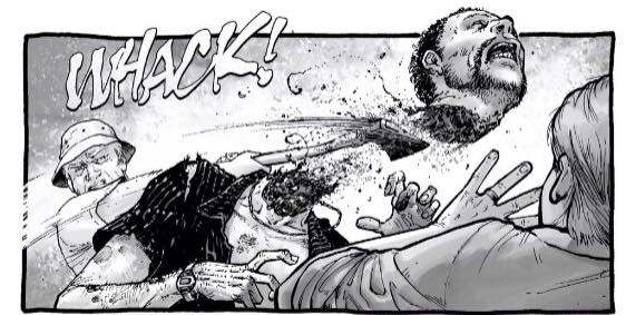
Creators can also use onomatopoeias as sound effects. Onomatopoeias are "...invented words that mimic sounds..." (Duncan  and Smith 156). In the panel to the right, the creators used the word "whack" as the sound an axe makes when chopping a walker's head off. The way the word is drawn is also a description of the sound and represents what is coming out of the walker (a.k.a., a zombie).

"A smell can be abstractly represented by graphic conventions" (Duncan and Smith 157), such as flies buzzing around something or someone with bad odor. The following panel has many flies buzzing around Glenn (right in the first panel) and Rick (left in the second panel), indicating that they smell bad. This is validated by the conversation they had about rubbing walker blood on them so they can blend in with the herd of walkers in the city.


No matter how inventive a creator is, it's all up to how the reader is influenced by the text and images of a comic book.
-Kylie Jamieson 
Works Cited

Duncan, Randy and Matthew J. Smith. “Experiencing the Story.” The Power of 
     Comics: History, Form, and Culture. New York: Continuum, 2009. 155-57.

Tuesday, October 13, 2015

Multimodal Meaning in Technique Evident in Civil War

This semester, I am reading Civil War, a comic that highlights the clash between Capitan America and Iron Man. There are many factors about this comic that pose interesting insights into the way messages are portrayed, and the way cartooning is used to describe ideas more abundantly than words can.

Like many Marvel comics, the detail in cartooning is very specific to showcase emotion. I had not previously noticed how photo realistic the cartooning appeared to be. The image of the various characters drawn can easily imitate a person in real life. It is important to note also that this photo realistic drawing of the various characters present in this comic does play an important role. Most Marvel comics deal with characters that are very different from the average human being because of the supernatural powers they posses. Beyond the knowledge of these supernatural powers, the author of Civil War uses photo realistic cartooning to present these characters as distinctly different from the average person-or average reader. Scott McCloud says in his instructional novel Understanding Comics “…characters were drawn more realistically in order to objectify them, emphasizing their “otherness” from the reader” (44). He mentions this as a trend in Japanese comics, but the notion can easily apply to Civil War as well. Below we have an example of this photo realistic drawing: 


Another unique element I noticed that helped me as a reader to form a better timeline of the story was the hermeneutic function of the textual countdown that appears on many of the pages. Duncan and Smith discuss the concept of hermeneutic images in their article, but I have taken their theory and applied it to a textual element Prior to the battle, a commentary on how many hours remained until the battle appeared. It was interesting that the author chose to use text to highlight the remaining time rather than a clock. Since the drawings of this comic are very detailed and the panel layout varies quite frequently from page to page, sometimes the subtitles within the comic were not as apparent to me as a reader. So to have the countdown appear at various spots until the battle, it almost seemed like the countdown did not have to appear apparent to the reader, like it was more of a subtle detail. When I first started reading the comic, I assumed that the functionality of the textual countdown would be consistent on every page. I was taken a back when I saw that not only did every page not contain a countdown, but the placement of that information, according to the page layout, shifted as well. Sometimes it was at the top of the page and sometimes it was at the bottom. As a reader, right off the bat, I chose to make that textual countdown my tool to help me follow the timeline of the story. The authors certainly played with my expectation, which I found interesting. Below we have an example of these textual countdowns. You may notice that in the first image (page 6), the countdown is present at the bottom right. On the second image (page 10), the countdown is present at the top left. 


It is interesting to view a Marvel comic so critically because there are so many subtle details that can go unnoticed if a reader is not aware of the various techniques that can be used to interpret a story. I look forward to continuing my reading of Civil War to notice the different ways messages are told through this comic.

By: Kirthana Sasitharan

Works Cited

Duncan, Randy and Matthew J. Smith.  “Experiencing the Story.”  The Power of Comics: History, Form, and Culture.  New York: Continuum, 2009.  153-70.


McCloud, Scott. Understanding Comics: The Invisible Art. New York, NY. Harper Perennial. 1994

The Comics Artist Challenge

Pertinent to our discussions in Comics Theory class. From the New York Times: 

The Comics Artist Challenge:

Can the power of graphic storytelling be communicated in one comic panel? A few intrepid artists accepted our challenge.


Architextuality in Blacksad: Somewhere within the Shadows


Gerard Genette's architextuality is one of the relationships a text has to other texts; specifically, it is a texts genre. Genre, as a classification, only makes sense through its connections to other texts in the same genre. These connections then create a set of expectations for texts in any given genre. Juan Diaz Canales and Juanjo Guarnido’s Blacksad: Somewhere within the Shadows has two architextual classifications, that is genres, Funny Animals and Film Noir. Each of these genres have their own set of expectations, which Canales and Guarnido intermingle, they play with these interpretive frames by both breaking and fulfilling these expectations.  


As you can see, all the characters in Blacksad are animals, anthropomorphised animals but animals all the same, which is what classifies it as a ‘funny animal’ comic. However, it breaks the expectations of this genre pretty much immediately by introducing a murder on the first page, which is a significantly heavier subject matter than what you would find in something like Donald Duck. However, this isn’t the first time a creator has used funny animals to tackle harder subjects, Spiegelman’s Maus being the most well-known. Like Maus, Blacksad uses the genre for the benefit of animal stereotypes. In Blacksad we see an untrustworthy and traitorous snake, a cold-blooded killer frog, and the loyal dogs of the police force (see above panel). Of course, understanding these references depends on a person’s resources for design, but when they are understood it gives the reader instant insight into the character’s personality. This use of stereotype actually gives the creators more room for storytelling, because there is less need for in-depth exposition in terms of character, no need to show personality traits when they are understood a first glance.


Where Blacksad breaks from the expectations set out by Maus, is in the art style. Spiegelman’s art style was more simplified than Guarnido’s. Guarnido’s art style is more detailed, closer to a realist style. This art style is more in-line with Blacksad’s other genre, Film Noir. Elements of Film Noir are also found in aesthetics of the setting and era: a gritty city in the late 40s/early 50s. More importantly though, is the plot, which firmly places it in the Film Noir genre; the story follows a somewhat shady private detective who is trying to solve the murder of his former flame (in the above panels you see Blacksad in a dive bar looking for information). This narrative fulfills the expectations of the Film Noir genre and therefor makes meaning making easier for the reader. Indeed, despite breaking expectations of funny animal comics, the use of animals also aids in meaning making, as I mentioned above, it gives the reader instant access to the characters and their world. In this way Canales and Guarnido truly blended architextual frames in order to create a unified whole. 

Nathanya Barnett

Saturday, October 10, 2015

An Attempt at Applying Groensteen's Theories to "Paper Girls"

In his book, System of Comics, Thierry Groensteen discusses the use of margins and frames to endow meaning to the narrative. He also explains how the site or position of a panel can affect the narrative. 

While perusing the first issue of Cliff Chiang and Brian K. Vaughan's "Paper Girls," I came across a two-page multiframe (as Groensteen might call it) in which the protagonist, Erin, abruptly wakes up from her nightmare and proceeds to confirm that it is, in fact, just a nightmare by ascertaining that her sister is still alive.


Upon initial inspection, a kind of closure occurs because the multiframe contains a stark contrast in colours between the bright, fiery tones of the first page and the calming blue tones of the second page, which indicates a disparity between the diegetic world of the first page and that of the second page. Similarly, the normalcy of the second page compared to the madness of the first page encourages the reader to backtrack to the first page and reevaluate what is happening in the narrative.

Once aware that the first page is a figment of Erin’s imagination, the reader can further scrutinize the first page to see that the panels on the page seem to be enveloped by the frameless panel at the bottom of the page that bleeds out and extends to the margins. In other words, the three enclosed panels all appear to occur within a dream-world, denoted by the merging of the hyperframe and the margin; the margin becomes part of the diegetic world. The reader becomes aware of this through the consistent framing of the first three panels, instilling what Groensteen calls a separative function, which guides the reader through each panel and aids the reader in negotiating narrative meaning throughout the sequence. The panels become progressively narrower as the nightmare reaches its end and bleeds out in the last panel, informing the reader that the nightmare is over. The narrowing of the panels in concert with the lessening text in the word balloons create a rhythm that is disjointed by the last panel because its enlarged bold text and its lack of a frame are inconsistent with the previous frames.


With regard to the concept of the site of a panel, the framed panel at the top left corner of the second page portrays Erin cracking her eyes open as opposed to the close-up panel of Erin covering her eyes in the first page. Instead of being a part of the dream-world, this panel is superimposed on an establishing shot of Erin’s room to show that this is taking place in her room. If this panel were absent or in a different location on the page, the narrative would be less coherent because a jump cut straight to the establishing panel would be more difficult to decipher as Erin waking up from a dream; therefore the panel serves a readerly function because it aids in the reader’s comprehension of the narrative.