Showing posts with label Comics Theory. Show all posts

Sunday, December 6, 2015

Speech Bubbles and Caption Boxes - Arkham Knight Genesis #2

WARNING: This post contains spoilers from Arkham Knight Genesis 2.

            Taking place before the final video game of the Arkham franchise, the Arkham Knight series follows the villain on his journey to overtake Gotham from the hands of his arch-nemesis, the Batman,(of which the Knight has a psychological fixation on). It was Carrier who mentioned the significance of speech bubbles in the comics form, noting the way words in speech balloons function much like the interior monologue in the novel--speech in any language, real or made up, can be attributed to depicted characters. We see how identifying speech bubbles in Arkham Knight work to represent certain characters, and how they would sound in real life. The speech bubble closes the gap between image and word, giving the reader more information to the comic.

Normal dialogue, as depicted in the first three panels, does not cue anything other than speech between Deathstroke and the Arkham Knight. However, something interesting happens in the first panel on the third tier that makes us reconsider what came before. The perspective is shifted from the Arkham Knight to then Deathstroke, where the words of the Arkham Knight now appear in blue speech bubbles with a much more straight-edge, rectangular shape bubbles. Audiences will read speech bubbles differently due to the fact, and it gives the Arkham Knight a robotic-type voice, very similar to the one heard in the game. Other than the obvious visual cues and reveal of who the character of the Arkham Knight is; if readers didn't see who was under the mask, it might be assumed that this character was indeed a robot. The effect of this is to humanize this character of the Arkham Knight to us, to show us what is under the costume; whereas the rest of the characters in the novel only see robotic-type, ruthless super-villain.


The creators of this comic also use boxes that almost appear to be like ripped out pieces of paper for the caption boxes of the comic. These boxes are the inner monologue of the Arkham Knight himself, and choosing the caption boxes to appear like pieces of paper ripped from a book hints that this comic is indeed meant to be the story of how the Arkham Knight came to be—and the ripped pieces of the page could signify the hardships the character has faced. We expect this kind of meaning from comics, according to Carrier, because we expect every picture element to contribute to the meaning of the image, and so read words within the frame as represented elements. This is definitely the case for Arkham Knight, wherein the reader is rewarded for viewing what is simply beyond the surface of the comic.

Written by: Alyssa Litynesky.

Controlling the Gaze in Grayson 12

WARNING: The following post contains spoilers for Grayson 12.

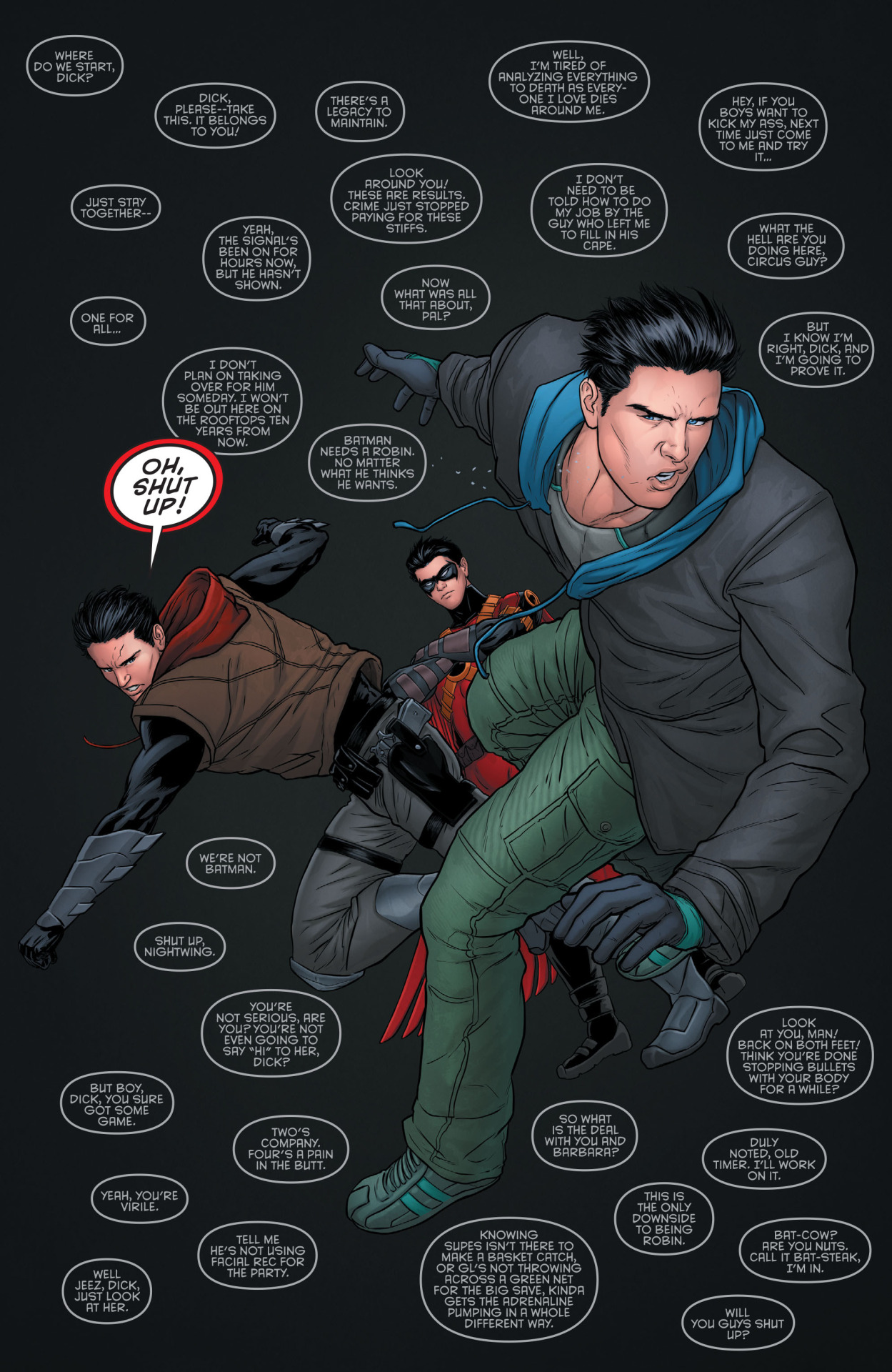
The twelfth issue of Grayson depicts Dick Grayson’s arrival back to Gotham City after following Bruce Wayne’s orders to fake his death in order to pursue an organization by the name of Spyral under a guise. However upon his arrival home, the rest of the Bat-family is less than pleased with his tactics; the issue takes careful time to illustrate each reaction. The narrative timing slows down for each of these pages, and uses Jesse Cohn’s idea of controlling the audience’s gaze.
Cohn states that many comic authors exercise a tight control over the reader’s eyes, a control maximized by the layout of the page from a visual organization standpoint.  The eyes are made to travel throughout the page. However, in the case of Grayson 12, the creators chose to guide the eye freely. While this freedom of movement can disrupt the experience of narrative continuity, most artists deploy other means to regulate the "reading path" taken, mainly by creating areas that are more prominent, which command attention.
This page illustrates Cohn’s point. While the position of the speech bubbles allows the reader to move freely throughout the page, there is still a focal point as to what should grab the reader’s attention first, which is Jason Todd’s speech bubble outlined in red and the characters—Dick Grayson especially considering he’s the largest on the page.

The bubbles surrounding the three characters on this page, while there is no technical ‘right way’ to read them, still guides the reader’s eye to ensure they don’t miss any detail on the page. Readers notice the details of each character’s face, their body language, what clothes they’re wearing and how it fits them, etc.

The comic continues to adopt this form through Dick Grayson’s interaction with each member of the Bat-family, and it’s effective due to the fact that it guides not only the eye but the time spent on the narrative aspects of each page. The reader follows the speech bubbles through the page and takes the time to read the speech of the past and really dwell on the pair of characters matched up in the situation, giving more meaning to the page as it becomes heavier and heavier with the knowledge of the past.


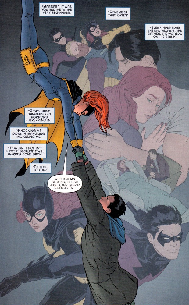
This is especially true when it comes to the interaction with Barbara Gordon. While the casual reader may not be aware of the deep rooted history between the two characters, the comic does an excellent job of highlighting that fact. The caption boxes here guide the eye throughout the page, each of the symbolic interactions between the characters with a focal point on the two in present day at the centre of the page.
This is an effective way not only to reach out the unaware audience as to the past that Grayson has with all the supporting characters in his comic, but also guide the timing of the narrative and the eye through all the pages of the comic.


Written by; Alyssa Litynesky 

Tuesday, September 29, 2015

Plutona - Through the Looking Glass


          As I started thinking about the composition of Plutona, I wondered how paneling played a role in the larger picture. At face value, the page layout is a background. It is a form of structure that is subtle. In Understanding Comics by Scott Mccloud, I learned that panel layout could be a powerful tool used to reiterate the message in the comic. Generally, comics are set up in the grid format with white gutters to highlight each panel and guide my eyes from left to right. An artist uses panels as a tool to not only guide, but to control. So, I wondered, what were the creators adamant about controlling within these two pages?
            In Plutona, the panels vary from rectangular to square. Unlike other comic strips, Plutona uses large panels, and sometimes no panels within a tier. One of the things that sound out is the fluidity of the tiers with no panel break. This speeds up the scene, making it a moment-to-moment action, rather than a direction shift. On the first page, there is minimal moment, with the tiers being used to display the room from different angles. I see Ray’s face (the young boy). I notice the bags under his eyes, which stick out in contrast to his light green eyes. I am then guided to the second tier with Ray’s father sleeping on the coach. Starting at the left, I am aware of Ray’s slouched body language; subtly evoking disappointment or contempt. I notice the cigarettes and empty beer bottles on the table, and lastly see Ray’s father. His clothing is minimal, with a great deal of dirt and ruffles on it. With no words, I am forced to grab information from the image. I start formulating ideas about Ray’s family dynamic with his family, and their living condition. I assume Ray’s father doesn’t have a serious job because he is still sleeping, instead of leaving, as Ray gets ready for school. The large panels are blow-ups into the life of Ray. It is character depth without any words. Words and sounds are used in the last panel, but they are very minimal. The first panel on the third tier is when movement really begins. The angle of Ray’s hand seems invasive to me as the reader. The cigarettes fill the page, making me feel angry that a young boy is smoking cigarettes. This tension is used by the creators to emotionally charge the panels. Nicely done.  
            The next page is full of speech bubbles and colour. Mie’s (the young girl) life appears very fast pace and family-oriented. She is seated at the dining table with her family for breakfast. The background gradates from dark to light orange. It is evident that the important on this page is narrative, rather than characterization development. I am not as engaged with Mie’s character in comparison to Ray. I assume this was done intentionally since he appears to be the “bad child” in the story. Mie’s page follows the same panel structure as Ray’s, yet the use of dialogue changes the tone completely. Although both individuals are irritated with their parents, they seem to be living different lives. This plays into the larger theme of the comic about four children, different in lifestyle being unified by something special.   

Monday, November 17, 2014

The Death- Defying Doctor Mirage

    The Death- Defying Doctor Mirage is the first issue out of 5 releases in the re-launched series. It was created by Jen Van Meter, Roberto De La Torre, and David Baron. Doctor Mirage can see the dead and talk to them. The only spirit that Doctor Mirage, or Shan Fong, can't talk to is her deceased husband. She uses this skill to solve homicides and is hired for a special task that gives her an opportunity to be potentially reunited with her decreased husband. The special task is to help a millionaire figure out why a demon is bonded to him.

        The paratext is very interesting on this issue. There are a couple of variant covers but I have one that is completely white with no images and just the title in the top right corner.
    This cover leaves much to be desired and I didn't have any expectations of the story when I began to read it. Normally, the paratext will give the reader ideas about what genre the story is about and set up expectations about the characters. I only had the name to base my judgments on and the name really didn't do much. The name suggested that it was going to be maybe an action comic about someone doing stunts and risking their life. The lettering of the title on the cover and the little skull drawing on top of the "i" seemed to suggest this comic to be lighthearted. I was clearly very wrong. 

    The colour palette is all dark colours such as blues, grays, and browns. There are defined lines and harsh shading. There isn't much contrast between the characters and the background in terms of colour. The characters seem to fade into the background in a few instances. This is done to have the focus on the narrative instead of the characters. The facial features of the characters are ambiguously drawn which Scott McCloud believes allows the readers to relate, but in this case, I couldn't feel more disconnected. The content is not relatable but really interesting. 

    The word balloons and thought balloons look exactly the same except that Shan's thought balloons have a slight green hue to them. This suggests that Shan's thought are "coloured" or influenced by her experiences. This is a clear indicator to the reader that Shan's thoughts are different from her speech. As well as the change in colour, there are some instances where her thoughts have a slightly different font from her speech or a different shaped balloon. Sometimes it was hard to distinguish what were word balloons or just thought bubbles. This suggests an intimate relationship with the readers since her thoughts are always available to be read and sometimes disguise themselves as word balloons.

Tamara Latinovic

Shooting War

Shooting war, by Anthony Lappe and Dan Goldman, is non fiction comic about a journalist who covers the war in the east. This comic is written in a very interesting style. The main character, Jimmy Burns, narrates his own life, as you read the story Jimmy talks about it to the audience as if this has happened in the past and he is discussing what had happened. Another thing that makes this story unique is that there are news articles placed in the story. These are news stories about Jimmy that are created as the story unfolds. Again, this adds to the affect that the reader is in this world and watching Jimmy on the news and following and staying up to date on his life.

In this news article Jimmy is talking directly to the audience, this makes the reader distance him/herself from the story and think about what the story is trying to do. This comic book, although non fiction, is set in the real world. In the above picture Jimmy is in the Ney York Post and to the side of him there is a picture of Larry king. Since it is set in the real world, it makes this story more real. This comic is mainly about the war in the east and the terrible things that are happening there. It makes the reader think.
    This comic art work also adds to the realism. The art work is realistic but also rough. faces have a lot of detail to them but the drawings also simplistic. This might be confusing. An example of this would be jimmy burns face when he is in the middle east. He grows a beard, but his beard looks like it was scribbled on with a pen.
 
   Another point to make about the art work is some of the pages aren't fully drawn. What I mean is some pages are simply a picture with the characters drawn on it. This makes the story seem more real and its message is stronger because of it. It adds to the idea that this story is about a news journalist in a war, as these pages are pictures that he took, or could have taken.
  This comic was, overall, very enjoyable to read and it makes you think about what is happening around the world. I look forward to reading more pieces from this author. 

Thursday, November 13, 2014

THE WICKED + THE DIVINE

    I'm not a complete stranger to graphic novels, but I've never picked up a recent issue of a currently running series before. This is the first issue of the series and it is about how 12 gods incarnate as humans every 90 years.The incarnated gods try to save the world using music but there is someone trying to stop them. This comic is published by Image and was created by Gillen McKelvie and Wilson Cowles. Reading this issue was completely different from any novel I've read before, especially knowing I had to wait until the next week to find out what happens next. Naturally, I did grab the second issue since the ending left much to be desired.

    What I loved most about this idea is that it comments on celebrity culture in the real world. People idolize  musicians and actors and they become more than human in our minds.The gods in this comic are only alive for 2 years then the human host dies along with the gods and the cycle has to occur again in 90 years. This also comments on how musicians are only truly "alive" in the consumers minds when they are producing something of value to them. Most of the gods in the comic look like musical icons such as Lucifer or "Luci" who has similar style to David Bowie. This is an example of intertextuality since the reader can identify this allusion to Bowie.

 
      The reader can relate to the protagonist, Laura, because she is a normal girl and a fan. When Laura becomes involved in a conflict with the gods, we see how the gods lose their aura of superiority with Laura as if we are learning and getting to know the gods along with her.
 
    The grid is mostly regularized and the panels are clearly defined except in some cases when the gods are in the panel. At one point, they transcend beyond the panel and into the above panel (see below). This mirrors the narrative in the sense that the gods are seen as superior and with egos hard to contain in the panel.
 
    The art style is very clean with defined hard lines. The colour palette is very vibrant which reflects the story since the gods have bold personalities to match the vibrancy. The superstar image is enhanced with the bold colours and draws the reader's interest.

    Braiding is seen through the issue since the reader begins to associate the finger snapping with power and destruction. This same image is used at the beginning of the issue and towards the end. It is almost always associated with violence since it is how the gods display their powers and someone always dies after it. 

Tamara Latinovic 


Thursday, November 6, 2014

Sleepy Hollow No.1

 
The comic that I chose to buy was Sleepy Hollow No.1. This comic is based off of the TV show of the same name, but I haven't seen it so this comic was a new experience for me. However, since I haven't seen the show I did feel a bit lost. There is very little character introduction if any, which I found odd since it was the first issue. Granted, this comic book would be aimed at people who have seen the show, but it doesn't help new comers who are interested in it. For example, The male lead isn't introduced at all, it opens with him buying sweets and he doesn't get a name until the 17th page. A lot of the side characters that only appear for a page or two have more introduction then he does, but again this is probably because the authors are writing this for people who have seen the show. 
 
    Anyway, the comic starts off with a blind potter who miraculously gains her sight back after the fire flares up from the oven; her eyes turn green and she can see. This first page does a good job of showing the reader what this comic will be about. It shows that it will be about the supernatural and it also foreshadows what is to come. Her glowing green eyes are just the start of the weird events that are happening around the town. There is a lot of mystery in this comic and it kept me wondering what was going on and why things were happening. In that respect it did a good job of keeping me interested and wanting to read more. Below is a page where the potter, who used to be blind, thinks she can heal people, but it turns out she is wrong.

The art style was enjoyable. there are a lot of dark lines and heavy use of shading and shadows that give it a eerie feel to it that complemented the story well. This also ties in to how light is shown. The comic is colorful, it's not colored with a dark or muted pallet, which is something that I expected. The light is bright and vibrant, but this is contrasted by dark shadows heavy lines. the bright light and the shadows work well together to really add to the story.


    Another thing worth mentioning is the references made in this comic. It uses historical dates, like the witch hunts and makes it part of the story, as if it were real. There are also references to Christianity and scripture. The two main characters are in search of Moloch, which is a devil from the bible. Moloch is also seen in other works, such as Milton's "Paradise Lost", and Ginsberg's "Howl". These references add another layer to the story if the reader knows about them.
    Overall I enjoyed this comic, it was a rough start having not seen the TV show, but the comic does stand on its own without the show. I look forward to reading the next installment of Sleepy Hollow.
 
 
Curtis Deslippe


Thursday, October 16, 2014

Birthright #1

Creator, Writer: J o s h u a   W i l l i a m s o n
Creator, Artist: A n d r e i   B r e s s a n
Colorist: A d r i a n o   L u c a s

S u m m a r y
Birthright #1 integrates two worlds of reality and fantasy.  The story begins in an autumn park with a father, Aaron, and his young boy, Mikey, playing catch. However, circumstances change when Mikey suddenly disappears.  Few weeks have passed and Aaron is accused of murder while his entire family falls apart.  However, after a year Mikey suddenly shows up as an adult in their lives claiming he has returned from a magical land called Terranos.


Right from the beginning the artistic style conveys simplistic lines and easy transition between panel to panel.  In Scott McCloud Understanding Comics: The Invisible Art indicates that simplification leads to identification where the reader recognizes and identifies with the characters.  Williamson is doing that so. He is presenting an intellectual and emotional relationship with the readers with clean/crisp images and easy font letters.  He is playing with different panel shapes to associate different types of mood and effects to enhance suspense , and passions within the reader.  It also pushes the reader in certain ways as they try to deal with something new.  His skill of allowing the reader to internalize with the characters gives a sense of mortality, a sense of how we reflect our own lives.


There are also sensory interpretations. In Duncan and Smith’s Experiencing the Story both the images and text affect the meaning altogether. However, it is the sound that suggests a powerful effect that builds the reliability of our ears. Williamson’s ability to use sounds helps establishes the character’s role. The image on the right depicts how young Mikey is faced with a monster. The sound of both the creature and Mikey suggest the appraisal of feelings and sensation (getting a prey or running from the predator). Time and space are one here making the reader pause for a moment to grasp the situation. Hence, our ears become more perspective as we pay attention to sound and pay less attention to our sight.


As with all comics, spacing is crucial. In Pascal Lefevre’s The Construction of Space in Comics suggest that the use of space presents different kinds of meanings. The diegetic space surrounding Mikey’s life makes the reader become more active as they try to put the fragments together. It is a place which allows speculation, fascination, and questioning. Here Williamson is presenting the set value of an individual life and the great diversity of experiences the characters had and/or are going through. Moreover, Jesse Cohn’s Mise-en-Page: A Vocabulary for Page Layouts looks at the page as a unit of design. There is a tension between sequence and sequence of a page that our eyes try to create meaning from everything. For example, the image below intrigues the reader to try and take it all in at once: the fantasy world, creatures, death, destiny and reality.
Williamson is resonating here the starkness of Terranos and the normalcy of reality.


 Similarly, Thierry Groensteen’s System of Comics indicates the importance of the relationship between the panels on a page (spatio-topica). Like Lefevre, Groensteen focuses on the fragments that link everything together. Readers are more absorbed in the story trying to contextualize the narrative. Birthright's use of colour, panel size, and panel placement becomes important to the functions of framing and eye movements. For example, the use of a burning and vibrant orange/red color of autumn and Mikey’s disappearance to the end page foreshadows that things are not what they seem, that something evil lurks around. On the contrary, the use of black and navy blue represents the normalcy of reality, of ordinary life, of singularity. Birthright prompts a wider illustration of human expectations that valorizes the questions of the impossibilities between reality and fantasy. 

Overall, I enjoyed the read and can't wait for the second to come out in November.