Showing posts with label Low. Show all posts

Thursday, December 4, 2014

Get Low


     It took me longer than I’d like to admit to finally choose a new series to write about. I purchased The After Life, Dark Engine, The Fade-Out, and The Woods before finally settling on Rick Remender and Greg Tocchini’s Low. Low is a sci-fi series that takes place after the decline of mankind (a world of regressing societies), and shortly before the destruction of the Earth as the death of the sun draws near. Remeder's story is enjoyable, but it was Tocchini’s artwork that initially pulled me in and then kept me reading. The artwork on the cover of issue one seemed more like something that should be framed and hanging on a wall to be admired rather than something I would thumb through and inevitably bend. As Douglas Wolk notes in his article Pictures, Words, and the Space Between Them, “every great” and most “decent-to-middling” artist “has a specific, intensely personal style,” (124), and although Tocchini's style is definitely distinctive,  I am torn as to whether or not that can be attributed to his line work, or his colouring.

             We are all taught that we are not supposed to judge a book by its cover, but when buying comics, the practice is necessary. The multi-modal nature of comic books means that much, if not most of the meaning we create when reading the text comes from the artwork. Wolk says that “the fact that drawing style is the most immediate aspect of comics means that what you see when you look at a comic book is a particular, personal vision of its artist’s vision,” (125). For myself, at least, this means that if we are to enjoy the work as a whole, it is important that we enjoy how that vision translates into images. Even before finishing the first issue, I was nearly determined to enjoy the story for the fact that I enjoyed the artwork so much.

            With my newfound love for Tocchini’s art style, it should come as no surprise that issue one seems more driven by what Jan Baetens calls monstration as opposed to the story's narration. Baeten describes monstration as “when the events are performed by the characters themselves in a situation in which the story seems to narrate itself, without any narrator’s intervention,” (149). The narrative is important for filling in gaps, but it is Tocchini’s artwork that sets about building a world that I want to explore. 

http://www.brokenfrontier.com/wp-content/uploads/2014/07/lowart.jpg
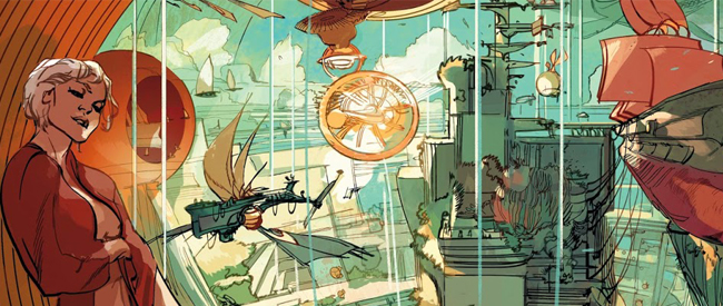
Image taken from www.brokenfrontier.com
Tocchini’s style is not one that relies on apparent divisions. His line work and colouring do not always match up, but often bleed into one another. Oftentimes (nearly every spread), panels overlap and cut off sections of one another, creating a claustrophobic feeling that mimics the seemingly crowded cities and cramped ships. When compared to this cramped layout, the sprawling panels (which often stretch over two pages) depicting the ocean work to emphasis emptiness and seclusion. Once again, it is arguably the artwork (monstration) throughout these pages shaping the reader’s experience more than the narration.

http://comichunter.net/wp-content/uploads/2014/10/Low+spread.jpg
As I’ve briefly mentioned earlier, Tocchini is also responsible for colouring Low. His use of a few dull colours lends to his unique, distinctive style, if not defines it entirely. The cover, shown above (Figure 1), contains nearly all colours that will be found throughout the issue. Depending on the location, single colours tend to dominate entire spreads (blue/green when depicting the ocean, a golden yellow when depicting the city, red when depicting danger, etc.), a theme that continues in later issues as well, working similarly to braiding, in that certain colours remind readers of certain locations in earlier pages and issues.

As readers, Low presents us with an interesting world, but more specifically, we are presented with beautiful visuals which alone are enough to justify purchasing at least the first issue. If you are interested in Tocchini’s other work, I recommend checking out his blog (http://gregtocchini.blogspot.ca/), which contains earlier work, and work in various stages of completion (which is particularly important when trying to get an idea of just how much his colouring style gives life to his art). Overall, Low has an interesting story that is sure to intrigue many sci-fi fans, but it is the artwork that allows Low to stand out among other series.


Works Cited
Baetens, Jan. “Revealing Traces: A New Theory of Graphic Enunciation.” The
       Language of Comics: Word and Image. Eds. Robin Varnum and Christina T. 
       Gibbons. Jackson, MS: UP of Mississippi, 2002, 145-55.

Remender, Rick and Greg Tocchini. Low #1. Berkeley, CA: Image Comics, 2014.


Wolk, Douglas. “Pictures, Words, and the Space Between Them.” Reading 
          Comics. New York: Da Capo Press, 2007. 118-34

Saturday, October 18, 2014

Guided View


           I had initially planned on focusing on Remender and Tocchini’s apocalyptic sci-fi series "Low," published by Image.  While I will reference the second issue of "Low" throughout this post, my attention will not be focused on the comic, but the digital medium in which I read it.
           I purchased a hardcopy of first issue of "Low" but could not find the second, and so I was forced to purchase a digital version from Comixology. I have only recently started using Comixology and I was unfamiliar with the Guided View feature available in their comic reader app, so I decided to give it a try. The Guided View feature presents panels one at a time “in a way that mimics the natural motion of the user's eye through the comic,” (comixology.com). To gain a better understanding of how Guided View alters the reading process I read "Low" #2 twice, once with Guided View and once without – both were completely different experiences.
In his text The System of Comics, Thierry Groensteen writes “at each ‘step,’ the question is asked at least virtually: Where must I direct my gaze next? Which is the panel that follows, in the order assigned by the narrative?” (34). When reading comics in the traditional way (seeing the full page, whether digitally or on paper), artists and writers tend to rely on page design, artwork, gutters, and speech balloons to gently nudge the reader along in certain directions.  Below (figure 1), is the first page of the second issue of "Low." The dark blue arrow indicates where my eyes were drawn to (and led) by the text, while the light blue arrow indicates where my eyes were guided by the artwork.


While I cannot say with certainty that this was how Remender and Tocchini intended the page to be read by their readers, it is likely that some of the numerous elements that directed my gaze were intentional. However, with Guided View, this directing of the readers’ gaze is more heavy-handed, and readers are no longer free or able to assess the page as a whole. While I disliked Guided View, its restrictiveness completely altered the pacing of the issue. Below are the panels as they are presented in Guided View, which can be compared to the page in its entirety (figure 1), offering a taste of the differing experiences each reading presents.


Groensteen says that “the panel is a portion of the page and occupies, in the hyperframe, a precise position,” and that this precise position “determines its place in the reading protocol,” (34). Yet, in Guided View, the reading protocol is determined for us since we are never presented with the page in its entirety. In fact, it would not be a stretch to claim that each panel becomes a page of its own as you view it, and in turn loses its precise position in the initial page which is not available to the reader in Guided View. This also means that the tension between panels (one of the four types of tension within a comic, as discussed by Charles Hatfield in "The Art of Tension"), is significantly altered, if not absent entirely. Once each panel becomes a page onto itself, Jesse Cohn’s idea of mise-en-page (the meaning created by the layout of the page, found in "Mise-en-Page: A Vocabulary for Page Layouts") is undermined as well, and readers can no longer easily re-evaluate panels and their relationship to the panels that surround them.
Even gutters disappear, at least in the traditional sense. No longer are there physical spaces between panels; they have been replaced by the intervals of time it takes one panel to transform into the next. Groensteen describes the spatial gaps between panels (traditional gutters) as resembling musical pauses/beats (60), yet the gutters created by Guided View do not resemble these types of pauses and beats, they are pauses and beats.
With a comic like "Low," and indeed most comics in general (with the exception of those that were designed to be read in Guided View), this new medium has the potential to alter the meaning we create from these texts as readers. This is something we risk as the medium of comics, and more specifically digital comics, evolves. As Scott McCloud points out, this can be expected when “appropriating the shape of the previous technology as the content of the new technology” (TED Talk). While Guided View does not make "Low" unreadable (it is still interesting, just different), and it does not completely alter all meaning within the text, it is interesting and important to understand the effects it has on our experience as readers.


-Andrew Kovacevic