Showing posts with label Comics. Show all posts

Monday, December 7, 2015

Teaching an Old Bat New Tricks about Comics


Writer: Paul Pope
Colourist: Jose Villarrubia
Publisher: DC 

Post by Jamie Adam

When you imagine comics, what do you think of? Thierry Groensteen argues, in his book System of Comics, that most people envision panels on a page. However, there is a crucial element frequently overlooked in this conception—the gutters. The imagined panels could not exist if there were no gutters, also known as the space between panels. This crucial space often goes unnoticed, so this post will shed some light on the function of the margins and gutters of a comics page.

Working from the outside in, the margins are usually comprised of the white space surrounding the page. Groensteen argues that the dimensions of a margin affects a reader’s perception of the page, as well as enhance the contents of the page (31). 

Moreover, when panels are lined up evenly, they form a border, or a frame, so Groensteen calls this effect the hyperframe. Groensteen writes, “the hyperframe separates the useable surface of the page from its peripheral zone, or margin” (Groensteen 31). He also says that “the hyperframe is to the page what the frame is to the panel” (31), but with one crucial difference—usually the hyperframe is intermittent. Again, the hyperframe is the space around the edge of the panels; it can be thought of as the inside border of the margin. Further, there are gaps in the hyperframe where the gutters between panels lie, making the hyperframe more conceptual than physical, as it is not a solid line, nor really an intentional element. 

So now that you know what the margin is, what the hyperframe is, and what gutters are, let’s look at an atypical example from Batman Year 100 to see how these aspects work in tandem to affect the reading of a comic.
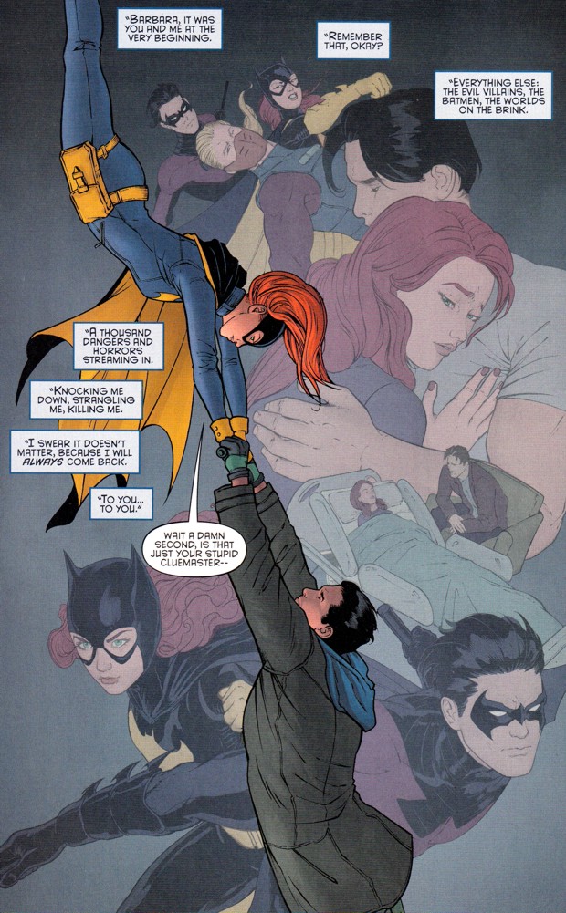
Here’s page 169:


Now, the border you see is added automatically when uploading a photo to the blog--the panels go right to the edge of the page in the book. It’s a subtle fact that you probably wouldn’t have noticed were we not discussing margins. So what effect does this have? Subconsciously, the reader takes note that there is so much action that it cannot be contained by traditional paneling, but goes right to the edge of the page on every side. Now look at the gutters—they’re not white. They’re a very light brown or beige. This lends the story a somewhat dirty, grimy feel. Think about the impact this scene would have if it had crisp, white margins and gutters. Not the same, is it? A one final point: if there are no margins, where’s the hyperframe in this example? I’ll tell you—it’s the outside edges of the page. Even if there are no margins, the hyperframe still exists.

Maybe now the gutters, margins, and hyperframe will get the recognition they deserve when thinking about and reading comics.

-Jamie Adam

Sunday, December 6, 2015

Controlling the Gaze in Grayson 12

WARNING: The following post contains spoilers for Grayson 12.

The twelfth issue of Grayson depicts Dick Grayson’s arrival back to Gotham City after following Bruce Wayne’s orders to fake his death in order to pursue an organization by the name of Spyral under a guise. However upon his arrival home, the rest of the Bat-family is less than pleased with his tactics; the issue takes careful time to illustrate each reaction. The narrative timing slows down for each of these pages, and uses Jesse Cohn’s idea of controlling the audience’s gaze.
Cohn states that many comic authors exercise a tight control over the reader’s eyes, a control maximized by the layout of the page from a visual organization standpoint.  The eyes are made to travel throughout the page. However, in the case of Grayson 12, the creators chose to guide the eye freely. While this freedom of movement can disrupt the experience of narrative continuity, most artists deploy other means to regulate the "reading path" taken, mainly by creating areas that are more prominent, which command attention.
This page illustrates Cohn’s point. While the position of the speech bubbles allows the reader to move freely throughout the page, there is still a focal point as to what should grab the reader’s attention first, which is Jason Todd’s speech bubble outlined in red and the characters—Dick Grayson especially considering he’s the largest on the page.

The bubbles surrounding the three characters on this page, while there is no technical ‘right way’ to read them, still guides the reader’s eye to ensure they don’t miss any detail on the page. Readers notice the details of each character’s face, their body language, what clothes they’re wearing and how it fits them, etc.

The comic continues to adopt this form through Dick Grayson’s interaction with each member of the Bat-family, and it’s effective due to the fact that it guides not only the eye but the time spent on the narrative aspects of each page. The reader follows the speech bubbles through the page and takes the time to read the speech of the past and really dwell on the pair of characters matched up in the situation, giving more meaning to the page as it becomes heavier and heavier with the knowledge of the past.


This is especially true when it comes to the interaction with Barbara Gordon. While the casual reader may not be aware of the deep rooted history between the two characters, the comic does an excellent job of highlighting that fact. The caption boxes here guide the eye throughout the page, each of the symbolic interactions between the characters with a focal point on the two in present day at the centre of the page.
This is an effective way not only to reach out the unaware audience as to the past that Grayson has with all the supporting characters in his comic, but also guide the timing of the narrative and the eye through all the pages of the comic.


Written by; Alyssa Litynesky 

Friday, November 27, 2015

Deadpool Kills Comic Conventions


Writer: Gerry Duggan
Penciler: Mike Hawthorne
Inker: Terry Pallot
Colourist: Val Staples

Jamie Adam

Deadpool has always been one to bend the conventions of comics. Marvel’s Merc With A Mouth is infamous for breaking the fourth wall, or addressing the reader directly, which does not occur extremely frequently in other narratives. However, in the debut issue of his new series released on November 4, Deadpool doesn’t speak directly to the reader, but there is a shining instance where his authors deviate from the conventions of comics regarding page layout and paneling. The creators play with what comics theorist Charles Hatfield would call the tension between a single image and an image in a series, using what Jesse Cohn deems a rhetorical planche. Wait, don’t go! I’ll explain what all this means!

At this point, I would like to call upon Duggan, Hawthorne, Pallot, and Staples to set the scene:


So clearly the man in orange is about to be wrongly executed, and Deadpool has just arrived to save him. What I find most interesting about this page, however, is the way the paneling is used to tell the story. The authors use what Jesse Cohn, in his Mise-en-Page: A Vocabulary for Page Layouts, would call a rhetorical planche. “Planche” is a way of expressing the layout of a page as a design element. In other words, it is simply the overall design of the page. So the planche is rhetorical because it assists in expressing the narrative. Again, the way the page is designed, the way the panels are laid out, helps to tell the story.

In the altercation depicted above, Deadpool seems to fire a shot directly at the reader in panel three. However, the following panel is slanted, and the final panel is basically falling off the page. When the reader puts together these two facts—the gunshot and the jarred panels—he or she makes the connection that Deadpool has shot the cameraperson; that’s why the panels have fallen—because we are experiencing the story through the person filming the ordeal, who has now keeled over from being shot.

Another useful theorist to bring into the discussion at this point is Charles Hatfield. In his book, The Otherness of Comics Reading, Hatfield states that “The ‘page’ (or planche, as French scholars have it, a term denoting the total design unit rather than the physical page on which it is printed) functions both as sequence and as object, to be seen and read in both linear and nonlinear, holistic fashion” (page 48). This series of panels in the Deadpool comic would not make as much sense if the final two panels were not skewed. Hatfield states that there is a certain tension between each panel read as an individual image and juxtaposing these images next to each other on the whole page. Peripherally, the reader can see that the bottom half of the page is black, which probably denotes death, as the space between panels (the “gutter”) is usually white. Furthermore, the reader should immediately notice the unusual positioning of the last panels, questioning the purpose of this technique and possibly piecing together the situation before it is even read. This is why Hatfield states that there is a tension between the panels and the page—the individual images can conflict when the page is seen as a planche.

So there you have it. Deadpool’s authors use a rhetorical planche to challenge the tension between individual images and the surface of the page. 

Armed with this knowledge, maybe you will more carefully consider the layout of a page when reading your next comic.

-Jamie Adam

Friday, November 13, 2015

Monsters are Real (In the Diegetic World)


Would you like to impress your friends with fancy terminology to describe comic books? If so, you’re in the right place! This post will discuss three ideas concerning comics narratives. Keep reading and you may learn something.

The following ideas will be applied to a single page (plus one panel) of the debut issue of Sanitarium, which is titled “Monsters Are Real.” The comic is published by Guardian Knight Comics, written by Bryan Ortiz, James Hartz, Evan Boston, and Scott “Diablo” Marcano, with illustrations and lettering done by Juan Romero.

Now onto the theory! In their book, The Power Of Comics, Duncan and Smith describe what is deemed the sensory diegetic, the non-sensory diegetic, and hermeneutic images. Let’s tackle them in that order.

First up is the sensory diegetic. The word “sensory” denotes the senses, and “diegetic” stands for narrative; therefore, putting the two words together is simply a fancy way of saying “the parts of the story world that are visually represented.” I say “visually represented” because comics are a visual medium—sounds, smells, tastes, and textures must be communicated visually for the reader.

The poster and desk in the first panel, the door in the fourth panel, and the bruises on Steven’s arm are specific examples of sensory diegetic. More generally, character interaction and the occurrence of any event is also sensory diegetic. 

Sensory diegetic is contrasted with non-sensory diegetic and hermeneutic (extra-diegetic) images. 

Next up is a bit of a grey area, attempting to distinguish a clear barrier between non-sensory diegetic and hermeneutic images. Non-sensory diegetic is when the comics medium is used to convey information, most commonly regarding a character’s mood or thoughts. Examples include a washed out/single-colour background to communicate a mood, or displaying emanata (from “emanate”), lines that stem from or surround a character to indicate surprise, anger, joy, etc. Below is the final panel on the preceding page, which includes such a background with emanata. 


That is a perfect example of non-sensory diegetic, which, again, is using the comics medium to convey information that is not literal to the characters. The background doesn’t suddenly flash a vibrant orange and no lines explode from Steven’s head. It is simply how the character’s inner state is communicated to the reader using the affordances of the comics medium. 

Finally is the hermeneutic element in comics, which involves information addressed to and intended solely for the reader. This would include any narration/voice-over. 

The best way to distinguish non-sensory diegetic from hermeneutic images is to ask yourself, “Are any of the characters privy to this knowledge?” In the single panel above, Steven is aware of his emotion, and so is his teacher. This makes it non-sensory diegetic. 

However, narration is generally intended for the reader only, making it hermeneutic. The characters hear no omniscient voice dictating their lives. 

So hopefully you learned something from this blog post. Don’t forget: sensory diegetic is the world of the story, non-sensory diegetic is the world of the story, too, but communicated specifically through conventions established by the comics medium, and hermeneutic elements assist the reader only (the characters are unaware of these elements).

Now pick up a comic book and think about what you’ve learned!

-Jamie Adam

Sunday, October 25, 2015

Groensteen's Verbal in Godzilla in Hell


For my first blog post I will be looking at Godzilla in Hell in regards to Groensteen’s view on verbal context in comics. Now, while the title does explain what the comic is all about, I should mention that Godzilla in Hell is actually a collaborated piece done by a different artist and writer every issue. This makes things somewhat easier as I am able to talk about a theory can be used though also a bit harder the two volumes I currently have are quite different. With that out of the way let me discuss this theory for each issue.

The first issue of Godzilla in Hell has no dialogue in it and only a small handful of words. Those words are huge stone letters that spell out the famous “Abandon all hope ye who enters here” from Dante’s Inferno. As Groensteen mentions, these words are used to help the reader understand just where we are exactly; if the title wasn’t enough of a giveaway for you. The only other word shown is the word “Lust”, this one doing a lot more for the reader as we now know what level of Hell Godzilla finds himself in. This allows use to predict what will happen next for him.


In the second volume the verbal is used differently. Nearly all frames have a caption box that describes what is happening to Godzilla and also what he is feeling and thinking. While it could be argued that the caption boxes are also used to help the reader understand what is going on since the art is more water colours and blurry than the last volume, it seems that this time the verbal is used to set the tone for the comic. The words chosen give this issue a more epic feel to it. Fitting of the images though sometimes we are reminded of the media we are reading here.


Overall, though, both issues do rely more on the pictures to tell the story rather than using words to explain what is going on. We get this more so from the first issue where Godzilla’s expression tells us more about what he is thinking and feeling than any words. The second issue does rely more on words but even then it is to help us understand what we are seeing. Both use the verbal in a way that adds to the comic not take away from it, though I feel that the first issue did this better. 

Kristen Barney
103857330

Friday, October 2, 2015

Keep Your Eye On the...?

The phrases "keep your eye on the ball" or "keep your eye on the prize" are common, something that you might hear multiple times a week. In comics, paying attention to what you should be look at isn't quite as easy as the phrases suggest. It can complicated at times to follow comics or to ensure that you are looking where the author and/or artist want you to be looking. Naturally, there are techniques that the creators can employ to try to direct your eyes. The October 2015 The Flash is an interesting case if you are looking at how the creators draw attention.

The page previous to this one is comprised of the dark blues and greys with only a small splash of beige. The bottom is completely dark. The action is growing more intense at this point but the reader is unaware of what might come next. Upon turning the page, a natural reaction might be to glance around the page. However, in this case, the bright red of the top left corner just about forces the reader to look there first. From there, the eye follows the bright spots on the page, which means that they follow the speech bubbles down and around the bottom of the page. This "L" motion across the page would finish with the reader having viewed the whole page but in a very specific way, one which the creators likely planned.


On the page above, your eye also catches the single, larger person on the top of the page. Realizing that this is a single individual encourages the readers eyes to move on, to find the next person speaking.

This second example is similar to the page above but is at the end of the comic. This time the reader takes in the page in in a counter-clockwise direction. The eye is drawn immediately to the red on the page. The red on this page is connected not only to the Flash but to the antagonist as well. The red continues to drag your gaze down the page, the speech bubbles following along side the red, until it becomes the muted and pale red/brown in the bottom right corner. At this point, the reader is aware that the Flash is in trouble but the muted colours help to make this point clear. He has been a bright red the whole rest of the comic but on this last page he becomes dull.

The use of colours on these pages along with the placement of the speech bubbles are only a few of the ways that the creators try to force the reader to look in a certain place, at a certain time.

-- Kelsey Jaques

Tuesday, September 29, 2015

Plutona - A New Reader's Comments


            Plutona by Jeff Lemire, Emi Lenox, and Jordan Bellaire is a new web-comic series by Image. Volume One of the comic follows the lives of four teenagers as they embark on a search for a young boy leads them to a superhero. Being that this is the first comic series I have ever purchased, a large portion of my expectations came from novels. If there were any visual aesthetics, they were more of a supplementary element for the texts. In my Comics Theory Class with Professor Dale Jacobs, we spoke about there being a tension between sequence and surface. As a new reader, it is easy to focus on the words for sequence since there are a lot of speech bubbles in this comic. I needed to engage the text at a higher conscious in order to focus on the layout and the other multimodal aspects. After reading the comic through with a focus on the literacy, I went back and paid attention to the surface of the comic. My eyes automatically drew to the unconventional use of the two-page spreads instead of the conventional rectangular panes. Me, as the reader felt more involved in this spread because I was in control of the direction of my eyes. The use of a clock to connect two panels brought a sense of realism to the tiers. I was aware of time within the medium, similar to that in film. The use of thick black lines for the characters allowed me to project myself into the character more. By the fifth page, I was emotionally invested in the development of the characters. Outlining the individuals are a part of the cartooning technique. In Understanding Comics by Scott Mccloud, he states, “cartooning provides us {the reader} the ability to not just observe, but to become it.” Mccloud attributes my submersion into the character due to the cartooning style. It is interesting that after I started looking at the drawing style, Mccloud’s theory seemed accurate. The character’s faces are very simplistic with only facial shading for expression and hairlines. Not only was I able to place real individuals at my high school to the characters, but also myself. Since the drawing lacked realism, it was able to slide into my fantasy; in my fantasy anything is possible. There are a lot more to say about the style and technique within this comic, but I will save those for the next draft. In the same way the authors are making me wait the next volume, I will also make you anticipate my next analysis of Plutona.


Plutona - Through the Looking Glass


          As I started thinking about the composition of Plutona, I wondered how paneling played a role in the larger picture. At face value, the page layout is a background. It is a form of structure that is subtle. In Understanding Comics by Scott Mccloud, I learned that panel layout could be a powerful tool used to reiterate the message in the comic. Generally, comics are set up in the grid format with white gutters to highlight each panel and guide my eyes from left to right. An artist uses panels as a tool to not only guide, but to control. So, I wondered, what were the creators adamant about controlling within these two pages?
            In Plutona, the panels vary from rectangular to square. Unlike other comic strips, Plutona uses large panels, and sometimes no panels within a tier. One of the things that sound out is the fluidity of the tiers with no panel break. This speeds up the scene, making it a moment-to-moment action, rather than a direction shift. On the first page, there is minimal moment, with the tiers being used to display the room from different angles. I see Ray’s face (the young boy). I notice the bags under his eyes, which stick out in contrast to his light green eyes. I am then guided to the second tier with Ray’s father sleeping on the coach. Starting at the left, I am aware of Ray’s slouched body language; subtly evoking disappointment or contempt. I notice the cigarettes and empty beer bottles on the table, and lastly see Ray’s father. His clothing is minimal, with a great deal of dirt and ruffles on it. With no words, I am forced to grab information from the image. I start formulating ideas about Ray’s family dynamic with his family, and their living condition. I assume Ray’s father doesn’t have a serious job because he is still sleeping, instead of leaving, as Ray gets ready for school. The large panels are blow-ups into the life of Ray. It is character depth without any words. Words and sounds are used in the last panel, but they are very minimal. The first panel on the third tier is when movement really begins. The angle of Ray’s hand seems invasive to me as the reader. The cigarettes fill the page, making me feel angry that a young boy is smoking cigarettes. This tension is used by the creators to emotionally charge the panels. Nicely done.  
            The next page is full of speech bubbles and colour. Mie’s (the young girl) life appears very fast pace and family-oriented. She is seated at the dining table with her family for breakfast. The background gradates from dark to light orange. It is evident that the important on this page is narrative, rather than characterization development. I am not as engaged with Mie’s character in comparison to Ray. I assume this was done intentionally since he appears to be the “bad child” in the story. Mie’s page follows the same panel structure as Ray’s, yet the use of dialogue changes the tone completely. Although both individuals are irritated with their parents, they seem to be living different lives. This plays into the larger theme of the comic about four children, different in lifestyle being unified by something special.   

Monday, December 1, 2014

Fables: Legends in Exile Review


     Fables: Legends in Exile Volume 1 is created by Lan Medina, Steve Leialoha and Craig Hamilton. The paratext offers the reader a little bit of information on what the story will be about. The title "Fables" suggests to the reader the graphic novel will be about fairy tales that the reader may be familiar with in North America. The images on the cover also offers the reader information since the image shows the fairy tale creatures on a subway. The reader automatically can understand that the novel will be about these fictional characters in 21st century modern society. The paratext suggest the genre of the graphic novel will be a type of science fiction rather than the mystery novel it will be.


     The art style seems "aged" because of the harsh dark lines and faded colours which mirrors the idea of fairy-tales since fables are old stories that have been passed down and retold for ages. The art style and colour also make identification hard for the reader. Scott McCloud would suggest that the more intricate a character's feature are, the harder it is to relate. In this case, the context of the story and the characters make the story harder to relate to for the reader. 

    Establishing shots are used every couple of pages to set the scene for the readers. These establishing shots mimic how mystery movies and TV shows function to engage the audience. These establishing shots happen every time a new character or a new dilemma is introduced. 

    The non-diegetic world contributes to the reader's understanding of the graphic novel. The reader has preconceived notions on what the characters will be like through the paratext and the reader also has some expectations on how the interactions between the character will go. The reader expects the Big Bad Wolf to be a villain because of his reputation while he turns out to save the day. The reader also excepts Snow White and Prince Charming to be living "happily ever after" while they are separated. 


Monday, November 17, 2014

The Death- Defying Doctor Mirage

    The Death- Defying Doctor Mirage is the first issue out of 5 releases in the re-launched series. It was created by Jen Van Meter, Roberto De La Torre, and David Baron. Doctor Mirage can see the dead and talk to them. The only spirit that Doctor Mirage, or Shan Fong, can't talk to is her deceased husband. She uses this skill to solve homicides and is hired for a special task that gives her an opportunity to be potentially reunited with her decreased husband. The special task is to help a millionaire figure out why a demon is bonded to him.

        The paratext is very interesting on this issue. There are a couple of variant covers but I have one that is completely white with no images and just the title in the top right corner.
    This cover leaves much to be desired and I didn't have any expectations of the story when I began to read it. Normally, the paratext will give the reader ideas about what genre the story is about and set up expectations about the characters. I only had the name to base my judgments on and the name really didn't do much. The name suggested that it was going to be maybe an action comic about someone doing stunts and risking their life. The lettering of the title on the cover and the little skull drawing on top of the "i" seemed to suggest this comic to be lighthearted. I was clearly very wrong. 

    The colour palette is all dark colours such as blues, grays, and browns. There are defined lines and harsh shading. There isn't much contrast between the characters and the background in terms of colour. The characters seem to fade into the background in a few instances. This is done to have the focus on the narrative instead of the characters. The facial features of the characters are ambiguously drawn which Scott McCloud believes allows the readers to relate, but in this case, I couldn't feel more disconnected. The content is not relatable but really interesting. 

    The word balloons and thought balloons look exactly the same except that Shan's thought balloons have a slight green hue to them. This suggests that Shan's thought are "coloured" or influenced by her experiences. This is a clear indicator to the reader that Shan's thoughts are different from her speech. As well as the change in colour, there are some instances where her thoughts have a slightly different font from her speech or a different shaped balloon. Sometimes it was hard to distinguish what were word balloons or just thought bubbles. This suggests an intimate relationship with the readers since her thoughts are always available to be read and sometimes disguise themselves as word balloons.

Tamara Latinovic

Thursday, November 13, 2014

THE WICKED + THE DIVINE

    I'm not a complete stranger to graphic novels, but I've never picked up a recent issue of a currently running series before. This is the first issue of the series and it is about how 12 gods incarnate as humans every 90 years.The incarnated gods try to save the world using music but there is someone trying to stop them. This comic is published by Image and was created by Gillen McKelvie and Wilson Cowles. Reading this issue was completely different from any novel I've read before, especially knowing I had to wait until the next week to find out what happens next. Naturally, I did grab the second issue since the ending left much to be desired.

    What I loved most about this idea is that it comments on celebrity culture in the real world. People idolize  musicians and actors and they become more than human in our minds.The gods in this comic are only alive for 2 years then the human host dies along with the gods and the cycle has to occur again in 90 years. This also comments on how musicians are only truly "alive" in the consumers minds when they are producing something of value to them. Most of the gods in the comic look like musical icons such as Lucifer or "Luci" who has similar style to David Bowie. This is an example of intertextuality since the reader can identify this allusion to Bowie.

 
      The reader can relate to the protagonist, Laura, because she is a normal girl and a fan. When Laura becomes involved in a conflict with the gods, we see how the gods lose their aura of superiority with Laura as if we are learning and getting to know the gods along with her.
 
    The grid is mostly regularized and the panels are clearly defined except in some cases when the gods are in the panel. At one point, they transcend beyond the panel and into the above panel (see below). This mirrors the narrative in the sense that the gods are seen as superior and with egos hard to contain in the panel.
 
    The art style is very clean with defined hard lines. The colour palette is very vibrant which reflects the story since the gods have bold personalities to match the vibrancy. The superstar image is enhanced with the bold colours and draws the reader's interest.

    Braiding is seen through the issue since the reader begins to associate the finger snapping with power and destruction. This same image is used at the beginning of the issue and towards the end. It is almost always associated with violence since it is how the gods display their powers and someone always dies after it. 

Tamara Latinovic 


Thursday, October 16, 2014

Birthright #1

Creator, Writer: J o s h u a   W i l l i a m s o n
Creator, Artist: A n d r e i   B r e s s a n
Colorist: A d r i a n o   L u c a s

S u m m a r y
Birthright #1 integrates two worlds of reality and fantasy.  The story begins in an autumn park with a father, Aaron, and his young boy, Mikey, playing catch. However, circumstances change when Mikey suddenly disappears.  Few weeks have passed and Aaron is accused of murder while his entire family falls apart.  However, after a year Mikey suddenly shows up as an adult in their lives claiming he has returned from a magical land called Terranos.


Right from the beginning the artistic style conveys simplistic lines and easy transition between panel to panel.  In Scott McCloud Understanding Comics: The Invisible Art indicates that simplification leads to identification where the reader recognizes and identifies with the characters.  Williamson is doing that so. He is presenting an intellectual and emotional relationship with the readers with clean/crisp images and easy font letters.  He is playing with different panel shapes to associate different types of mood and effects to enhance suspense , and passions within the reader.  It also pushes the reader in certain ways as they try to deal with something new.  His skill of allowing the reader to internalize with the characters gives a sense of mortality, a sense of how we reflect our own lives.


There are also sensory interpretations. In Duncan and Smith’s Experiencing the Story both the images and text affect the meaning altogether. However, it is the sound that suggests a powerful effect that builds the reliability of our ears. Williamson’s ability to use sounds helps establishes the character’s role. The image on the right depicts how young Mikey is faced with a monster. The sound of both the creature and Mikey suggest the appraisal of feelings and sensation (getting a prey or running from the predator). Time and space are one here making the reader pause for a moment to grasp the situation. Hence, our ears become more perspective as we pay attention to sound and pay less attention to our sight.


As with all comics, spacing is crucial. In Pascal Lefevre’s The Construction of Space in Comics suggest that the use of space presents different kinds of meanings. The diegetic space surrounding Mikey’s life makes the reader become more active as they try to put the fragments together. It is a place which allows speculation, fascination, and questioning. Here Williamson is presenting the set value of an individual life and the great diversity of experiences the characters had and/or are going through. Moreover, Jesse Cohn’s Mise-en-Page: A Vocabulary for Page Layouts looks at the page as a unit of design. There is a tension between sequence and sequence of a page that our eyes try to create meaning from everything. For example, the image below intrigues the reader to try and take it all in at once: the fantasy world, creatures, death, destiny and reality.
Williamson is resonating here the starkness of Terranos and the normalcy of reality.


 Similarly, Thierry Groensteen’s System of Comics indicates the importance of the relationship between the panels on a page (spatio-topica). Like Lefevre, Groensteen focuses on the fragments that link everything together. Readers are more absorbed in the story trying to contextualize the narrative. Birthright's use of colour, panel size, and panel placement becomes important to the functions of framing and eye movements. For example, the use of a burning and vibrant orange/red color of autumn and Mikey’s disappearance to the end page foreshadows that things are not what they seem, that something evil lurks around. On the contrary, the use of black and navy blue represents the normalcy of reality, of ordinary life, of singularity. Birthright prompts a wider illustration of human expectations that valorizes the questions of the impossibilities between reality and fantasy. 

Overall, I enjoyed the read and can't wait for the second to come out in November.

Saturday, October 11, 2014

Pushing the Boundaries: Framing of Panels in Vera Brosgol’s "Anya’s Ghost"


      As the very cover suggests, one of the most deliciously used comic features in the graphic novel Anya’s Ghost is the playful framing and insetting of panels. In this statement image, the reader is able to infer from the title that Anya is the more detailed, life-like character whose hair is inhabited by a more whimsical, ghostly figure who can rightly assumed to be the girl’s ghost friend. Anya’s hair in this instant acts as a sort of panel containing the ghostly figure. The reader can draw several conclusions about what the characters are like just by this intertwining of them on the cover; by being inside Anya’s hair, does the ghost actually inhabit her imagination or is the ghost more of a nuisance (i.e. by ‘getting tangled’ in Anya’s life)?  Whatever the interpretation may be, the cover image sets the reader up to believe that the relationship between these two characters is forefront in the story to come.

      Throughout the majority of the graphic novel, Vera Brosgol uses square or rectangular, straight, thin, black-lined frames with grids ranging anywhere from one to eight frames – an average page looks like the one on the left:


           Thus, anychanges in framing draw a great amount of attention, such as on page 13 (the one on the right). Based on the reader’s interpretation of what constitutes a panel, this page either has one large panel or one panel with five inset panels, totalling six. I happen to subscribe to the second theory since the images in the inset panels have each their own purposes outside of the main panel and require just as much individual attention even if they are inset, and especially because the reader at this point experiences the first break in Brosgol’s regularized framing. Instead of crisp, straight lines, the inset panels are framed with jagged, hand-drawn lines that surpass each other and extend beyond the panel corners. 

The regular frame style of previous panels are easily ignored, for the most part, when it comes to reading the novel. The framing of the inset panels alludes more to reliance on experience and feeling; the jagged lines reflect Anya’s frustration at the time and also how the events taking place happen so quickly and without her consent that she cannot recall them as clearly as she could otherwise. The overlapping edges of these panels also reflect how quickly the action takes place – what Scott McCloud would call 'moment-to-moment' transitions, and with no chance of a gutter to appear.

            The following two pages also showcase different ways of framing panels to further meaning and understanding of the novel and, more directly, Anya:


          The panels on the page on the left are angled to portray the action in the panels as less controlled, disorienting. However, the reader still experiences the straight, thin lines framing the panels. The page on the right uses an entirely different technique to frame the panels. This page seems to have one large panel with four inset panels that still read in the very linear manner of left to right, up and down. I claim that these four smaller panels are inset because what actually frames these panels in the background of the larger panel. The smaller panels do not have defined frames; they seem to float on the page with softer edges than the larger framed panel containing them. These absent frames (but still clearly different panels) are soft and heavily shaded to reflect the diegetic world in which Anya is waking up from being knocked unconscious from a fall. By the time her eyes are completely open and she is wide awake, the panel frame is back to the straight, black line format. Thus, when Anya returns to normal, so does the framing.

          Brosgol also plays around with framing techniques notably when Anya is dreaming (page 111) and when the history surrounding her ghost friend’s death is being told (pages 154-6). In conjunction with Thierry Groensteen's assertion that every aspect of a comic adds to its narration, it is important that the differences in panel framing within a work and between works are not ignored considering they can translate to the reader key information about the story at hand whether it’s blatantly apparent or not. Even the feeling that a certain line style gives is an important contribution to the reading experience of the graphic novel.